Friskies logo and symbol, meaning, history, PNG
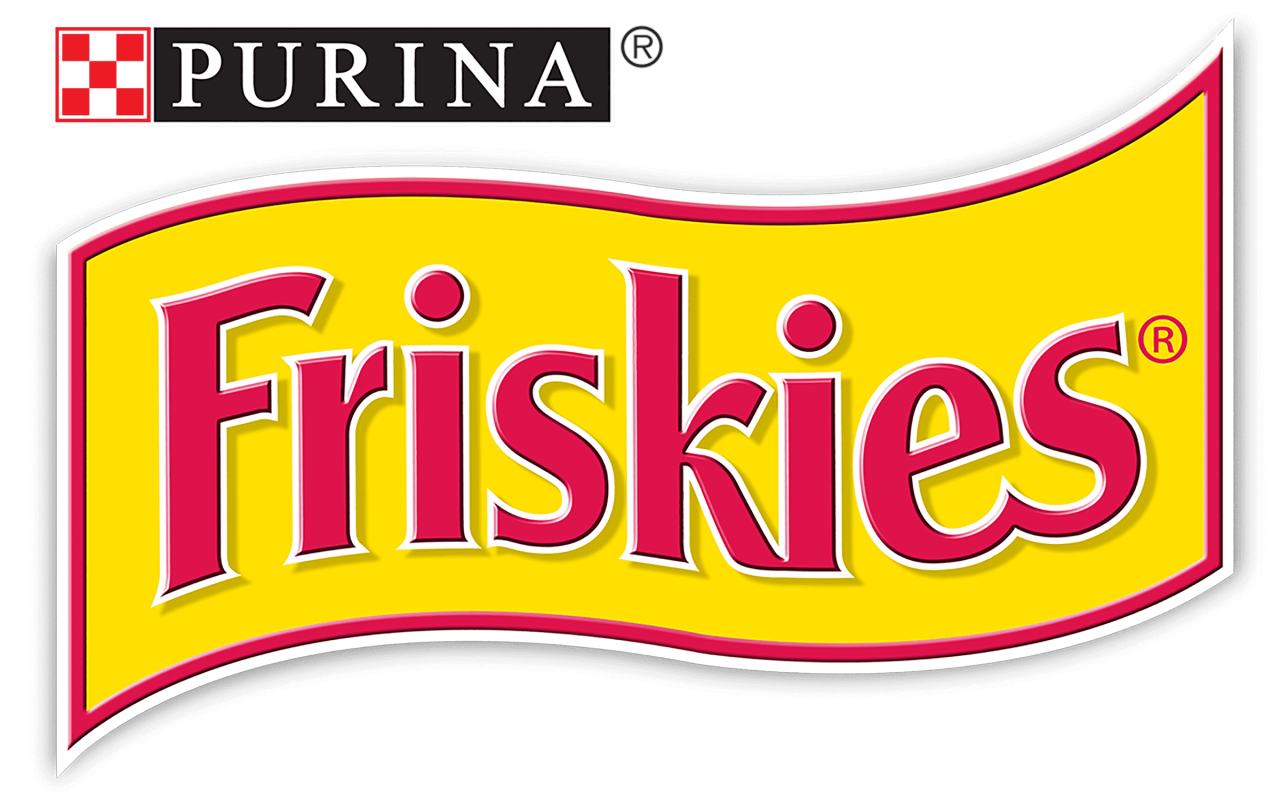
- Download PNG Friskies Logo PNG Visual consistency has been a characteristic feature of the Friskies logo throughout its almost 90-year history.
- Meaning and history The origins of the brand date back to the 1930s.
- It was introduced as a dry dog food brand but was reintroduced as cat food in the 1950s.
- 1930 – 1999 The old logo looked pretty much like the current one.
- Even the type was somewhat similar, with the extended and diagonally cut end of the “F,” the unusual curves of the “k” and the shortened top right stroke of the “r.” 1999 – Today The design grew a little cleaner and more elegant.
- The red outline of the flag has become thinner.
- The letters have also lost some of their thickness, due to which they look slimmer.
- Note, for instance, the first “s,” which has been straightened.





Leave a Review