Fresno Grizzlies logo and symbol, meaning, history, PNG
- Download PNG Fresno Grizzlies Logo PNG The Fresno Grizzlies are a Minor League Baseball club playing in the Pacific Coast League and affiliated with the Houston Astros.
- Meaning and history The history of professional baseball in Fresno, California, started in 1898, while the team itself traces its roots to 1969.
- In each of them, the team’s mascot, a grizzly bear, is either present in person or has left its mark.
- 1998 — 2001 The first Fresno Grizzlies logo featured a furious bear throwing a baseball.
- The “bear” concept here was implemented through grey “scratches” over the letters.
- 2005 — 2007 The grizzly bear’s footprint became the focal point of the 2005 logo, where it was placed inside a shield shape.
- Here, the color scheme was a completely new one.
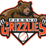
- 2008 — 2018 The primary Fresno Grizzlies logo features the bear with long and sharp claws above the wordmark and a baseball.
- Executed in the same brown, black, red, and white color palette, the new badge boasts a stronger character and evokes a feeling of range, looking aggressive and confident.
- The bear in this emblem is drawn in profile, facing to the left, with its four claws elongated and stylized as four blades.
- The lettering is placed under the image, in two lines, with the upper one in black, and the “Grizzlies” in red.
- The wordmark is crossed by four diagonal lines, repeating the four blades of the graphical part.
- Colors While the team’s official colors are black, orange, and white, the logo also features several shades of brown, which seem perfectly natural for a “bear” theme.
- Video







Leave a Review