Freshly logo and symbol, meaning, history, PNG
- Download PNG Freshly Logo PNG Freshly is an American online food delivery service that works like a subscription.
- The company offers fresh meals delivered to your door on a weekly or monthly basis.
- The website of the brand contains all the information on how and where the dishes are being cooked and packed.
- Meaning and history The visual identity of the food delivery service is unique and memorable.
- The dark green and white color combination of the company’s visual identity is a perfect reflection of the service’s purpose and core — delivering fresh food to the customers across the United States.
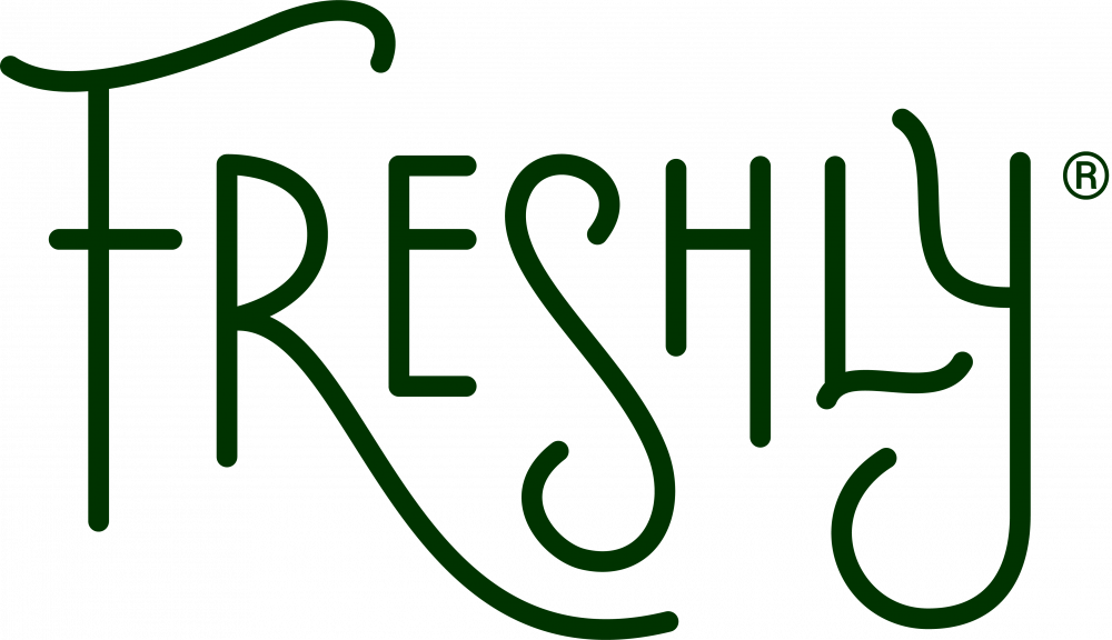
- Font The wordmark in all capitals is executed in a custom hand-drawn typeface with no serifs.
- The lines of the jumping letters are elongated and curved, which makes the whole logotype playful and elegant.
- Every letter of the inscription has a unique feature: “F” has its vertical bar elongated and its upper horizontal bar curved, the tails of the letter “R” is elegantly reaching the curved tail of “S”.
- Review The website of the American meals delivery service is bright and informative.
- Here you can find dozens of videos, telling about products and the cooking process of the company’s meals, there is also a lot of information on the ingredients’ benefits and the latest research in this field.
- The company offers to choose from four options: 4 meals per week, 6, 9 or 12.
- You can also see what it was on the menu last week and browse the whole selection of dishes the company has to offer.
- Under the menu section, you can read about diet preferences and portions, along with some general information on shipping and on how long does the meal lasts.
- Everything is written here in detail, but if you still have questions left — there is a great customer support team, available 24/7 and capable to answer everything you may need.





Leave a Review