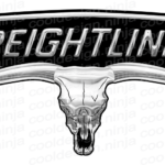
Freightliner logo and symbol, meaning, history, PNG
- Download PNG Freightliner Logo PNG The American truck manufacturer Freightliner Trucks has been exceptionally consistent in its visual brand identity.
- And yet, if you compare some of their old models side-by-side, you may notice that they bear slightly different versions of the Freightliner logo.
- Since 1981, it has been the property of Daimler AG.
- If you take a closer look, you will notice the height of the glyphs slightly varies.
- The central glyphs are the highest, while those on the sides are lower, which creates a 3D effect.
- The interplay of the silver and white highlights and the black background adds some volume, too.
- The wordmark is placed inside a shape looking pretty much like an ellipse, at first sight.
- However, in fact, the shape is somewhat more complex due to the asymmetrical top and bottom.
- Also, the line forming the “ellipse” has varying thickness adding to the 3D effect.
- Alternative versions You can come across a logo where the top of the “ellipse” looks sharper and higher than on the regular one.
- The thickness of the border of the “ellipse” is the same over its all course.
- They were sold under the “White Freightliner” brand and bore a badge based on the regular Freightliner logo.
- One of the versions of the logo was white with a red background.
- Also, you can come across a version of this emblem where the background is black, while the word “white” is given in a regular sans serif typeface.


Leave a Review