Foton Logo and symbol, meaning, history, PNG
- Download PNG Foton Logo PNG Foton is the name of a Chinese automaking company, which was established in 1996 and specialized in the production of large vehicles, such as trucks, buses, tractors, and other agricultural machines.
- The subsidiary of the BAIC Group, today Foton is one of the largest companies in Asia in its segment and has almost 49 thousand employees.
- Meaning and history Foton is the company, which is more concentrated on the quality and reliability of its cars, than on the design of its logo or advertising materials.
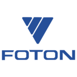
- The Foton logo is composed of two parts — a circular badge, and lettering, which can be placed on the right from the badge, or under it, with or without a tagline with the name of the brand written in Chinese.
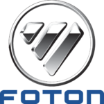
- The most common version of the Foton logo includes an enlarged badge in a circular frame, set above the calm blue lettering in all capitals.
- The badge featured a gradient silver triangle, pointing down, formed by three diagonal segments, placed with some space between each other.
- The upper corners of the triangle are diagonally cut, making the whole figure looks like a five-pointed Diamond, a reflection of precision, chic, and luxury.
- The voluminous silver frame of the Foton emblem softens the geometric symbol and adds some balance to its massive segments, elevating the look of the badge and making it complete and harmonized.
- The rounded shape of the badge is also harmonized by the rounded angles of the Foton inscription, placed under the emblem.
- Only the “T” and “N” have some elements with straight cuts, while all other letters feature soft shapes and a very friendly mood.
- As mentioned above, the logo of the brand can also be executed in a slightly different manner — with the circular badge placed on the left from a two-leveled inscription in dark gray.
- Font and color The bold and sleek Foton logotype in all capitals is executed in a smooth extended sans-serif typeface with straight cuts and softened angles of the massive square letters.
- As for the color palette, there can be two options — glossy silver and calm yet intense blue, and silver with dark gray, almost black.
- Both variants look confident and actual, showing the brand as a reliable and strong one, and reflecting its willingness and ability to grow, move, and improve.






Leave a Review