Fort Wayne Komets logo and symbol, meaning, history, PNG
- Download PNG Fort Wayne Komets Logo PNG The history of the Fort Wayne Komets started in 1952 in Fort Wayne, Indiana.
- The first franchise stayed in Fort Wayne till 1990 when they were relocated to Albany, New York to become the Albany Choppers.
- Their place in Fort Wayne was taken by the Flint Spirits who had already had a five-year history as an ice hockey team.
- The bold black letter “K” was drawn on his Jersey, and the hockey puck was replaced by a stylized black image of the comet.
- 1970 — 1980 The redesign of 1970 simplified the Komets visual identity to a solid orange badge with a bold serif letter “K” written in black and outlined in white.
- 1980 — 1985 In 1980 the contours of the badge were refined and the orange and black color palette was switched to bright red and blue.
- 1985 — 1988 In 1985 the concept of the Komets visual identity was changed and now the main element of the badge was a dark blue stylized letter “K” set above the delicate sans-serif “Hockey” inscription and decorated by a stylized orange puck on the right.
- 1988 — 1990 The redesign of 1988 brought a new image to the hockey club from Fort Wayne.
- In the center of the emblem, there was a white outlined circle with a stylized letter “K” and a hockey stick on it.
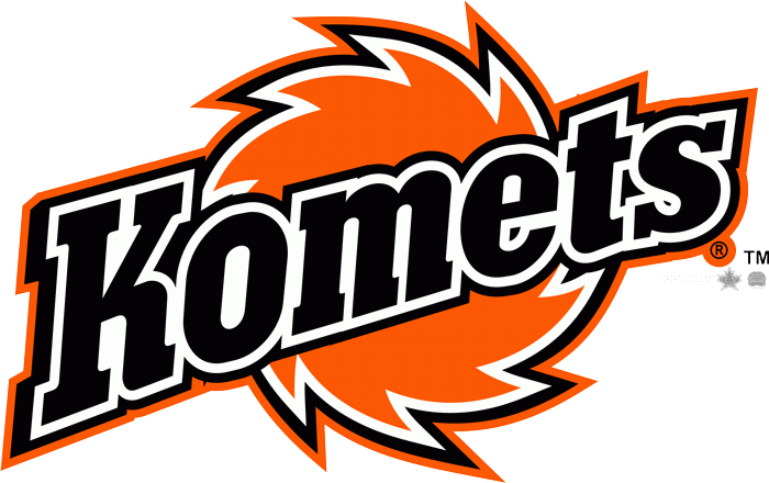
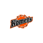
- The logo consists of just two elements.
- The first one is the name “Komets” in large black letters with white and black outlining.
- Each next letter is smaller than the previous one.
- Some fans are skeptical about it.
- People also wonder why the team name is spelled with the letter “K”.






Leave a Review