Family Guy logo and symbol, meaning, history, PNG
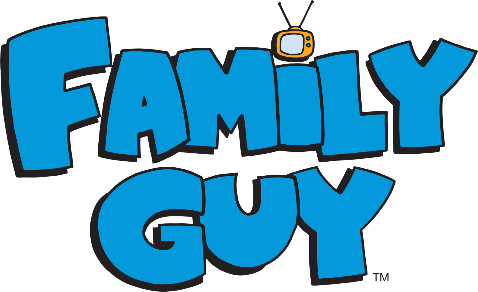
- Download PNG Family Guy Logo PNG Family Guy is an animated sitcom made by Seth MacFarlane for the Fox Broadcasting Company.
- Meaning and history Seth Woodbury MacFarlane, who is today known as an actor, animator, writer, and producer, conceived the sitcom in 1995, during his student years at the Rhode Island School of Design.
- To begin with, the very shape of the letters – plump, stout, somewhat rounded – resemble the figures of the main characters of Family Guy (especially the males from the Griffin family).
- On the pilot logo, this similarity is emphasized by using various colors for each letter.
- Also, there were quotation marks on each side of the name of the cartoon.
- Like the letters, they were colored in different shades.
- This time, the animated series appeared with an updated logo, which looked calmer without sacrificing its meaning.
- This time, all the glyphs were of a single color, light blue.
- The letters became slightly more rounded and bold (look, for instance, at the “F” and “Y”).
- While the letters in the pilot Family Guy logo were of almost the same height, the primary logo used a different approach.
- Another distinctive alteration was the introduction of the TV set.
- It was positioned above the “i” replacing the generic dot.
- This made the logo simpler and more effective without any damage to the meaning.
- Colors The light blue dominating the Family Guy logo is rather saturated.





Leave a Review