Fall Out Boy logo and symbol, meaning, history, PNG
- Download PNG Fall Out Boy Logo PNG While the “crowned volcano” is probably the most known Fall Out Boy’s logo, the American rock band also has had other emblems featured on the album covers.
- Meaning and history The history of the band began in a suburb of Chicago in 2001.
- 2002 — 2003 The very first version of the Fall about Boy logotype was pretty simple — a bold black inscription in a traditional sans-serif, with no extra space between the three parts of the band’s name, but with the “F”, “O” and “B” slightly bigger than the other capital letters of the wordmark.
- 2003 — 2005 The redesign of 2003 made all the letters the same in size, but switched the color palette to bright blue on a white background and separated the words from each other with additional space.
- 2005 — 2007 In 2005 the band started using a delicate and fine logotype where all the uppercase letters were executed in a classy and elegant serif typeface.
- The “Fall” and “Boy” parts of the band’s name featured the same style and size — uppercase lettering in a bold sans-serif, while the “Out” between them was written in the lowercase in a lighter font.
- 2013 — 2016 The logotype from 2013 featured a slightly narrowed sans-serif inscription with an uneven black texture of the letters.
- The custom sans-serif typeface with smooth lines and rounded angles looks playful and fun, showing the unique character of the band and their style.
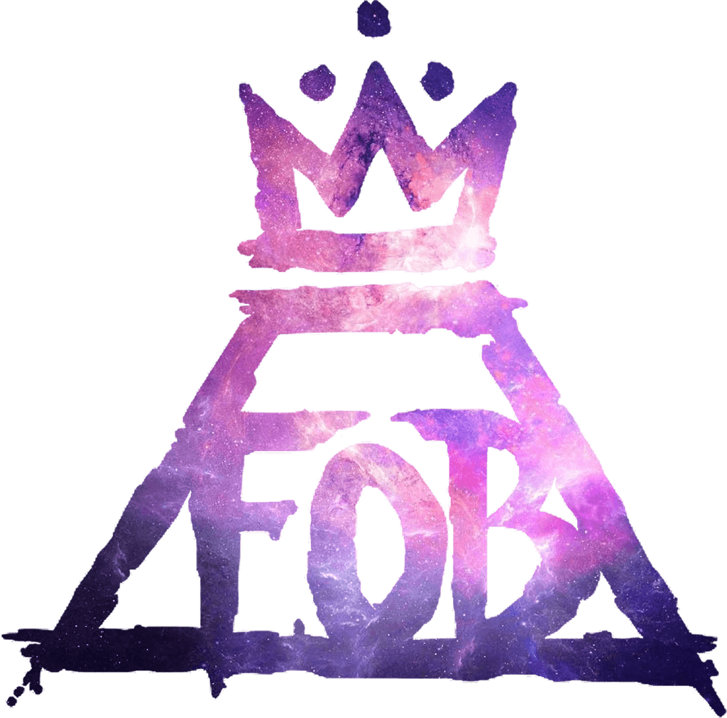
- The “crowned volcano” symbol The most popular Fall Out Boy logo can be seen on the cover of the 2013 album Save Rock and Roll.
- Rike is an Ohio-based graphic designer, who used to play in several rock bands.
- Inside the trapezium, there’s the lettering “FOB” in large letters.
- The outlines look uneven as if the image has been drawn with casual strokes of a thick brush.
- The trapezium supposedly represents a volcano.
- Above the keyhole, there was a crown, while below it there was a banner housing the name of the band.
- Another popular logo is featured on the cover of the 2017 album Mania.
- There’s a cross design made up of four right angles.
- Font While we can hardly talk about a font in case of the main Fall Out Boy logo, each album cover does feature the name of the band in a distinctive type.
- Every time, the type is chosen according to the overall design of the cover.
- Colors While the palette features just black and white, the combination gets a hint of unique style and mood from the way the two colors are used.
- Here, black dominates the logo as the background color, while white is used for the emblem itself.








Leave a Review