evolution history and meaning, PNG
- Download PNG Eurobank Logo PNG While Eurobank has a distinctive and bright logotype, it may seem somewhat cluttered.
- Meaning and history Old The old Eurobank logo showcased the name of the bank in white inside a bright red rectangle.
- To the left, there was an emblem, which could be described as a whirl inside a white square.
- The whirl could be interpreted as a stylized “e.” The name of the brand was given in an unpretentious sans serif type.
- It looked rounded and friendly.
- The word consisted of only lowercase glyphs.
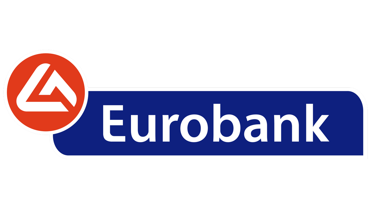
- Current emblem While the updated logo is pretty different from the original, you can still perceive a distinct link between them.
- The type has grown slightly bolder, while the initial “E” has been capitalized.
- The red rectangle was replaced by a blue shape.
- It was still based on a rectangle but had two of its corners rounded.
- The whirl turned into a stylized triangle with rounded corners, which was formed out of two abstract shapes.
- Font While the type used in the Eurobank logo may look pretty simple, it has a unique touch.
- The company is headquartered in Belgrade, Serbia and has 80 branches within the country.
- Its parent company is Greek Eurobank Ergasias.


Leave a Review