Eugene Emeralds logo and symbol, meaning, history, PNG
- Download PNG Eugene Emeralds Logo PNG The team established in 1955 is the Class A short-season affiliate of the Chicago Cubs.
- Meaning and history The baseball franchise the Eugene Emeralds, which belongs to the Northwest League, has updated its logo twice since 2004.
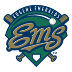
- 2004 — 2009 The 2004 Eugene Emeralds logo depicted the letters “EMS” with a baseball flying over them.
- The design was placed inside a dark green shield with two crisscrossed baseball bats behind.
- 2010 — 2012 As a result of the 2010 redesign, the lettering “EMS” was replaced by “Emeralds” and a depiction of the Emerald Valley was added.
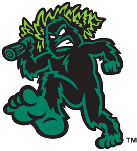
- 2013 — Today The current logo, which was developed in collaboration with Brandiose, features Sasquatch, a creature that, according to North American folklore, lives in the woods of the Oregon state.
- Colors Using the fluorescent green as a logo color has been problematic for a minor league team with a limited printing budget.






Leave a Review