Espanyol logo and symbol, meaning, history, PNG
- Download PNG Espanyol Logo PNG Espanyol is the name of a Spanish football club, which was established in 1900 in Barcelona.
- Meaning and history The visual identity of the Spanish football club has been redesigned many times throughout the club’s history, but the concept, from which the current logo was born, was created in the 1930s, and modified by today.
- 1900 — 1902 The very first logo for the club was designed in 1900 when its name was Club Español de Fútbol.
- The badge was composed of red and yellow football with the “CEF” lettering on it.
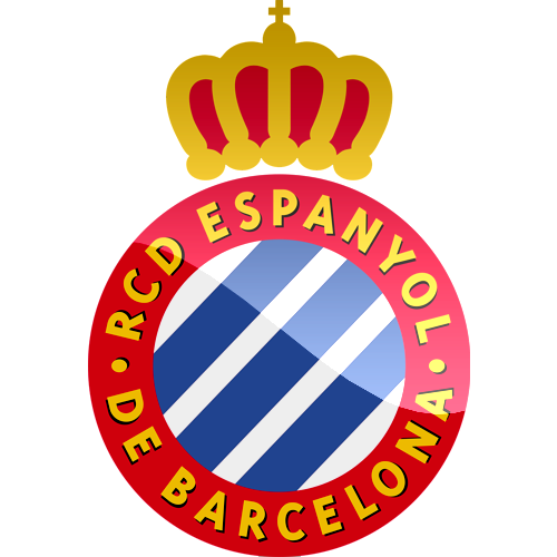
- The rounded emblem of the club now featured a blue and white striped pattern, enclosed in a wide red frame.
- 1912 — 1923 The new logo was created for RCD Español in 1912: the lettering is removed from the body of the badge, and now the full wordmark is written in yellow around the red frame’s perimeter.
- Another new thing on the logo is a red ornate crown, placed on top of the circle.
- C. D. E.” Lettering is yellow was placed on a red wide line on the top of the badge, with a red and yellow crown above it.
- 1931 — 1934 The circular badge comes back in 1931, but the crown is being removed from the official logo.
- The lettering around the emblem’s perimeter now features a bolder and more confident sans-serif typeface.
- 1940 — 1995 The logo is being refined again in 1940.
- 1995 — 2005 The redesign if 1995 brings bold lines and bright colors to the club’s visual identity.
- The composition of the logo remains the same, everything is just a bit enlarged and looks vivid and fun.
- The colors become a bit darker and calmer and the lettering now has a thin shadow, which adds volume to the image.





Leave a Review