Eastern League logo and symbol, meaning, history, PNG
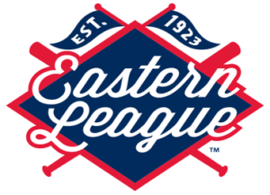
- Download PNG Eastern League Logo PNG There’s certainly a pirate theme inspiration behind the Eastern League logo.
- For one, the crisscrossed baseball bats are reminiscent of the legendary flag (Jolly Roger).
- Also, there’re actually two flags on the top of the logo, which make the pirate theme even more prominent.
- Below the flags, there’s the lettering “Eastern League” in a white script.
- It is placed over a navy blue rhombus “standing” on one of its obtuse angles.
- This emblem was introduced in 2018.
- The earliest Eastern League logo (1988-1997) depicted blue crisscrossed baseball bats with the letters “E” and “L” on both sides.








Leave a Review