Dulux logo and symbol, meaning, history, PNG
- Download PNG Dulux Logo PNG Dulux is a brand of paint, created for both interior and exterior architectural needs.
- Meaning and history Before 2001 The old logo depicted a wordmark with a circular emblem on its left.
- The wave motif was the basis of the brand’s visual identity — with the smoothly curved bottom of the inscription and two white waves on the emblem.
- 2001 – 2010 2010 – Today The name of the brand, Dulux, says a lot about the quality of its product — luxury.
- And the visual identity of the world’s most famous paint label only adds to this feeling, elevating the brand to a new level due to the perfect execution and juicy color palette.
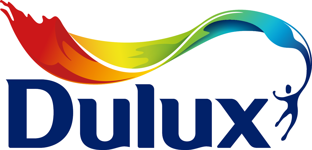
- The current company’s logo was designed in 2010 and is completely different from the previous one, though keeps the blue color of the lettering and the style of the typeface.
- The current visual identity is composed of sleek lettering with an emblem, depicting a human silhouette in motion, holding a huge waving flag, which spreads to the left, covering the nameplate from the top.
- The flag is drawn in the rainbow color spectrum, showing the variety of colors and styles, the paint label offers for any interior and exterior design possible.
- The Dulux logo is contemporary and dynamic, looking elegant and fine it reflects the progressive brand with strong principles and value of quality and design.
- The logo is positive and evokes a sense of creativity and friendliness.
- Its sleek smooth lines resemble a Mart Ultra Font, but with softened angles and refined contours of the letters.
- It is a precisely executed inscription, which is sleek and luxurious, as the brand’s name.
- The iconic label not only produces paint, but there is also an assortment of various coating and adhesives in its catalog.
- It has several sub-brands, committed to delivering a suitable solution to all the possible needs of the company’s customers — waterproof, weather-resistant, glossy and silky textures.


Leave a Review