DKW logo and symbol, meaning, history, PNG
- DKW specializes in the design and production of sedans and motorcycles.
- Meaning and history 1916 – 1932 The DKW badge created in 1916 stayed with the brand for more than a decade and has never actually been replaced.
- The iconic badge remained untouched till the end of the brand’s history.
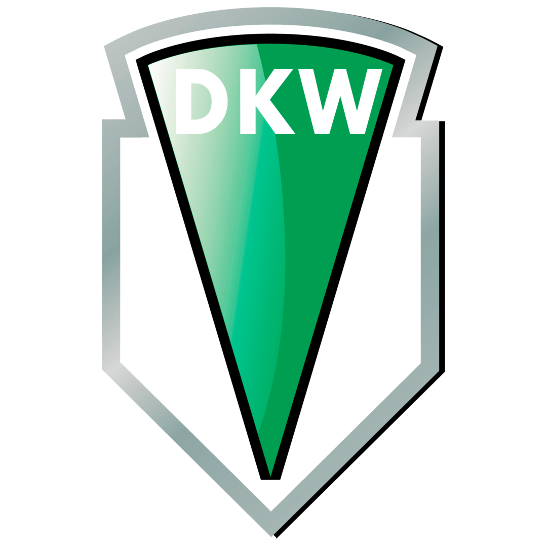
- It was a thin green triangle pointing down placed on a white background and enclosed into a black thick frame, with the upper line arched from the center, and the bottom — sharpened.
- The white “DKW” lettering was set on the bottom of the badge, on a green background, and executed in a bold and modern sans-serif typeface.
- 1921 – 1932 In 1921 the logo was refined and modernized.
- Though the concept and color palette remained untouched, some gloss and gradients were added to the emblem, and the black framing switched to silver gray.
- Another changed was inside the crest — the grass green triangle gained a thin black outline.
- 1932 – 1949 In 1932 the logo used by the brand featured a famous four rings concept when the four major German brands merged to form Auto Union.
- It was a blue and white logo, where the emblem of each marque was placed inside a separate ring.
- This, there was the Audi ring, DKW ring, Horch, and Wanderer rings.
- 1949 – 1966 In 1949 the brand starts using its stylish green and silver badge again.
- It was the same emblem as in 1921, but with the black triangular outline replaced with a silver-gray one.
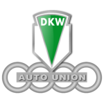
- The DKW crest was placed above the silver Auto Union badge, with four silver rings and a horizontal banner with the lettering coming through the middle of the composition.





Leave a Review