Disney Princess logo and symbol, meaning, history, PNG
- Download PNG Disney Princess Logo PNG Disney Princess (Princess Line) is a media franchise and toy-line including several fictional female characters from different Disney franchises.
- You could see the word “Princess” in an elegant type inspired by handwriting.
- While the letters looked as if they had been written by hand and had the curves needed to join them, they weren’t actually joined and had white gaps in between.
- Above the word “Princess” in dark blue, you could see a tiny Disney’s wordmark in pink.
- 1999 – 2000 The handwritten type was replaced by block letters.
- Yet, they still looked girlish and elegant due to the varying widths of the strokes 2000 – 2002 The logo is now dominated by the Disney wordmark, while the word “Princess” is very small.
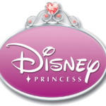
- The text is placed inside a white ellipse with pink trim.
- Yet, versions with a solid pink ellipse are also used during this period.
- 2008 – 2009 The logo is placed inside a pink ellipse with a gradient and silver trim.
- The decoration on the top imitates decorations on the crown.
- 2009 – 2011 The design gets a couple of slight, barely noticeable tweaks.
- 2011 – 2014 The brilliant heart on the top grows more prominent.
- 2014 – Today The oval on the Disney Princess logo has been replaced by the banner.
- The word “Princess” has grown larger than “Disney” and now features a decorative script with plenty of swirls.






Leave a Review