Detroit Lions logo and symbol, meaning, history, PNG
- It all started with a bit naive and very detailed image executed in a realistic color palette, and throughout the year the emblem came to a modern and bright badge, which could easily be used by a luxury car marque.
- 1934 — 1945 The very first logo for Detroit Lions football club was introduced in 1935 and featured an orange and blue composition, where the lion with its mouth open and a football player with a rugby ball in his hands was facing right.
- It was a simple and delightful emblem, which was just a graphical representation of the team’s name and purpose.
- 1946 — 1969 The redesign of 1946 brought a completely new image to the Detroit Lions visual identity, making the emblem modern and stylish.
- The new badge was composed of two wide vertical stripes in blue and gray, placed on a white background, and a white lion’s silhouette in a thin blue outline.
- It was a stylish and fresh emblem, representing the progress and confidence of the football clubs 1960 — 2002 In 1969 the lion was redrawn again.
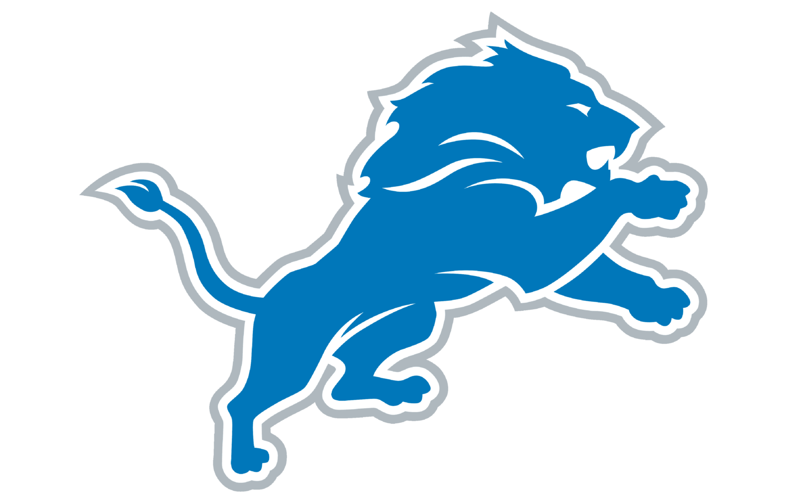
- Two stripes were removed from the background and the lion’s silhouette was now executed in solid blue, outlined in white and blue.
- This version of the logo stayed with the team for more than forty years.
- 2003 — 2008 With the redesign of 2003, the color palette of the Detroit Lions visual identity was slightly modified: the outer line of the image was switched from blue to black, giving a stronger contrast to the drawing and adding professionalism and determination to the club’s qualities.
- 2009 — 2016 The blue lion’s figure gained some white accents in 2009.
- 2017 — Today The redesign of 2009 only switched the color of the emblem’s outline, but the whole mood of the logo evolved.
- It looks unique due to the unusual sharp elements at the ends of the letters.
- Color The team’s official colors include Honolulu blue, silver, and white.
- All of them can be seen in the current Detroit Lions logo.





Leave a Review