evolution history and meaning, PNG
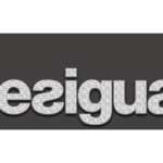
- Download PNG Desigual Logo PNG The Desigual logo seems a perfect implementation of the brand’s motto “Forward is boring.” Desigual is said to be the first international brand to permanently rotate its wordmark.
- “We live in illogical times,” commented Alex Bennett Grant from WE ARE Pi, the Amsterdam-based creative agency that developed the advertising campaign for Desigual.
- Meaning and history The brand was established in Ibiza, Spain, in 1984.
- Ever since, it has been known for its vivid colors and playful patterns.
- The old logo was already pretty unusual because the “s” glyph was displayed back to front.
- By the way, other than the “s,” the design looked pretty simple and traditional.
- However, it was often placed over bold color splashes, which added the necessary youthful and rebellious spirit.
- 2019 logo When in July 2019 the brand introduced its new logo, it caused a lot of discussions.
- In fact, the company just flipped its logo.
- So, now you may need a mirror (or a mental effort) to read the name of the brand.
- As Desigual explained, the reason behind the update was the desire “to be more faithful to what we are.” They also cited their intention to “see life from another point of view.” Guillem Gallego, the brand’s chief marketing officer, explained that the previous logo where the “s” was displayed back to front was meant to show that Desigual wanted to “embrace difference and make a statement.” In 2019, they just decided to use the same approach to all the letters in the Desigual logo.
- And yet, we should say that while the logo with the inverted “s” was still quite legible, the 2019 version is very difficult to read, which can damage the customer’s experience with the brand.


Leave a Review