Denver Broncos logo and symbol, meaning, history, PNG
- The team is owned by Pat Bowlen and managed by Joe Ellis, with Vic Fangio as the head coach.
- There were different designs and color schemes, but the bronco horse has always been there, as a tribute to its state, famous for its horse riding and an amazing bucking horse, symbolizing grace and power.
- 1960 — 1961 The original logo, designed in 1960 depicted a football player riding a bronco horse.
- There was a bold big yellow letter “B” on his brown t-shirt.
- The football player was now standing on the back of the orange horse.
- The was wearing an orange, white and blue uniform and had an orange football in his hand.
- The red of the letter was switched to orange and the horse’s outline — to blue.
- The lines were refined and the emblem got a fresher and a more modern look.
- 1993 — 1996 The redesign of 1993 made the Denver Broncos logo sleeker and cleaner.
- The steam, which was coming out of the horse’s mouth, was now drawn in white and outlined in black with no extra lines on it.
- 1997 — Today The redesign of 1997 brought the new emblem to the team.
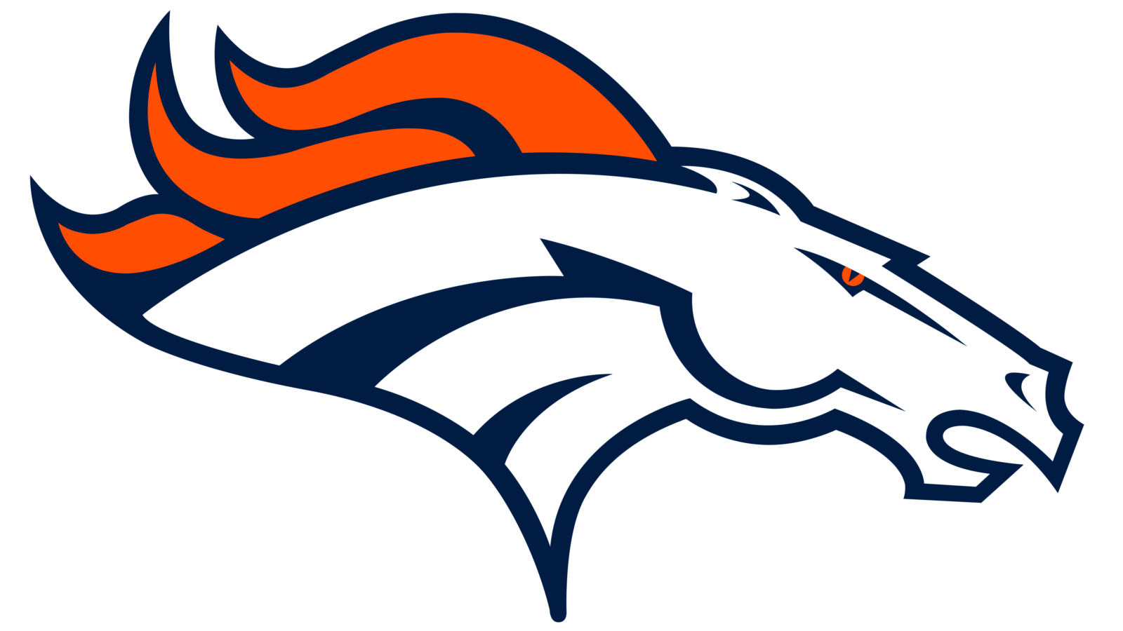
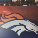
- Now the famous football club’s visual identity depicts a horse profile, facing right, into the future.
- The bronco’s head in white features dark blue outlines and accents, while the mane of the animal and its eye are colored orange.
- Denver Broncos Colors BRONCOS ORANGE PANTONE: PMS 1655 C HEX COLOR: #FB4F14; RGB: (251, 79, 20) CMYK: (0, 75, 98, 0) BRONCOS NAVY PANTONE: PMS 289 C HEX COLOR: #002244; RGB: (0, 34, 68) CMYK: (81, 45, 0, 75) Video





Leave a Review