Dayton Dragons logo and symbol, meaning, history, PNG
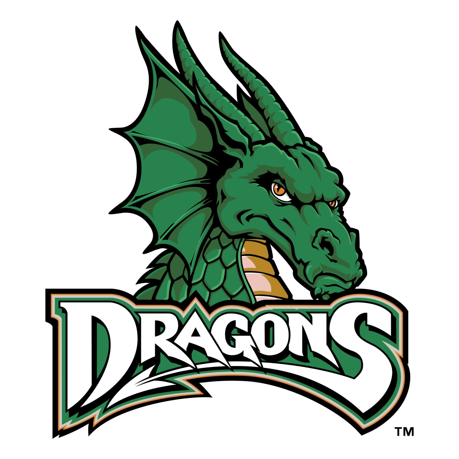
- Download PNG Dayton Dragons Logo PNG The minor league baseball franchise the Dayton Dragons is part of the Midwest League and the Class-A affiliate of the Cincinnati Reds.
- Meaning and history The franchise started its history in 1988 in Rockford, Illinois.
- Originally, the team played as the Rockford Expos.
- It went through three more names before relocating to Dayton, Ohio, in 2000 and adopting the current brand identity.
- Primary symbol The green dragon seen on the Dayton Dragons logo has orange eyes and chest.
- The creature has a menacing look on its muzzle.
- Cap emblem The cap insignia features a large green “D” with a “tail” looking very much like a dragon’s one.
- Colors In addition to green and several shades of yellow and orange, the logo also sports white and black elements.





Leave a Review