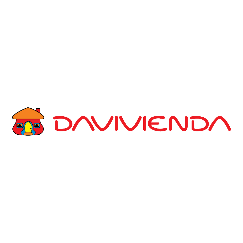
Davivienda logo and symbol, meaning, history, PNG
- Download PNG Davivienda Logo PNG Davivienda is a financial organization from Columbia, which was established in 1972.
- Today one of the largest banks in its country, Davivienda is owned by Grupo Bolivar and specializes mainly in providing financial services to agricultural and rural segments.
- Meaning and history Davivienda is one of the very few banks in the world, featuring a very kind and cartoonish visual identity, which makes everyone feel a child reading a fairytale.
- 1972 – 1976 The very first logo of Davivienda featured an image or a red house with a white roof and smooth arched walls.
- In the middle of the house, there was a white arched door drawn, surrounded by two small white and gray windows on both sides.
- The wordmark in all capitals was placed under the image, executed in a bold geometric sans-serif typeface in the same shade of red.
- 1976 – 1987 The redesign of 1976 brought a new color palette — red became brighter, while white and gray elements got replaced by yellow and sea-blue.
- As for the lettering, it kept the original style and contours but gained a brighter red shade.
- 1987 – 1997 In 1987 the red house became three-dimensional.
- 1997 – 2006 Ten years later, in 1997, the bank came back to the flat design, though decided to keep the color palette of the three-dimensional version.
- Another big change was made to the wordmark, which got a new typeface for the first time in the bank’s history.
- Font and color The Davivienda lettering in all capitals, placed under the emblem and drawn in red, boasts a very modern rounded sans-serif typeface, which has a futuristic style and reflects the company’s progress and energy.
- There are no horizontal bars in the letters “A”, and almost all the contours are arched and smooth, besides two “I”s, which also look friendly though.
- The red, orange and yellow color palette of the Davivienda logo reflects warmth, passion, and love, and shows the importance of family and home.


Leave a Review