D.C. United logo and symbol, meaning, history, PNG
- Download PNG D.C. United Logo PNG D.C. United is the name of one of the strongest clubs in Major League Soccer, which was established in 1996 in Washington DC.
- Meaning and history The visual identity of the football club from Washington DC is all about power and strength.
- Its iconic symbol, a black eagle, has been with the team since the very beginning and was only slightly modified throughout the years.
- In the beginning, it looked a bit like a Nazi symbol but turned into something really stylish and remark-able.
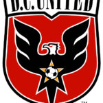
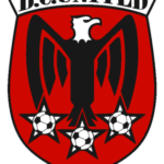
- 1996 — 1997 The original logo, introduced in 1997, was composed of a sleek crest with smooth sides and sharp angles.
- The black lettering in classy bold serif font perfectly balanced the black eagle with a white head, placed on a red background.
- Under the eagle there were three white stars in a black outline, each of them featured an image of a football in the middle.
- The black, red, and white color palette of the D. C. United visual identity reflected the courage and strength of the team, making the logo timeless and actual.
- The shield became wider and its contours — bolder.
- As for the eagle, it turned its head to the left and was now outlined in white, which made the whole badge more distinct and clean.
- The stars under the bird were re-moved, but now another star appeared on the eagle’s body — it was yellow with a monochrome football on it.
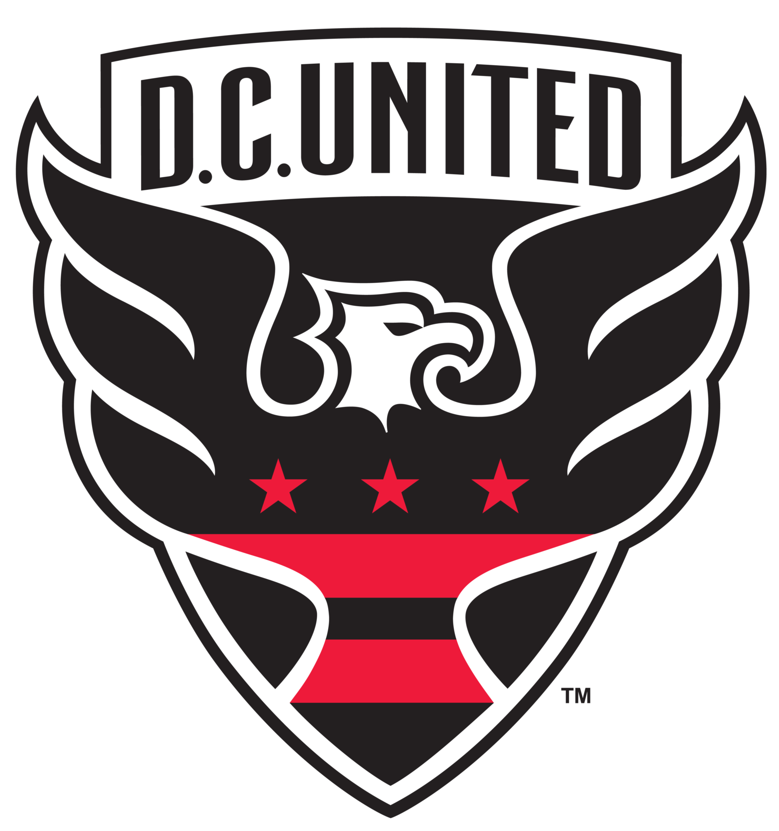
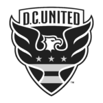
- 2015 — Today The redesign of 2015 made black the main color of the club’s official palette.
- The shield was all black now, as well as the sans-serif inscription in its upper part.
- As for the star, it is now replaced by two red horizontal stripes and three solid red stars, placed on the body of the bird.




Leave a Review