CSKA Moscow logo and symbol, meaning, history, PNG
- It is owned by VEB.RF with Yevgeni Ginger as a president, and coached by Viktor Goncharenko.
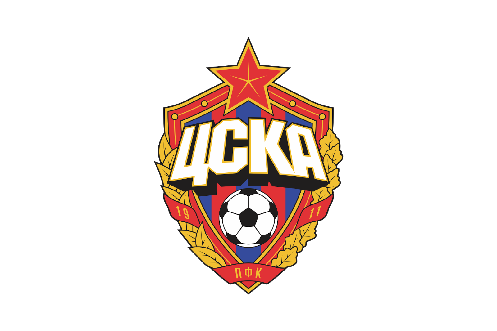
- Meaning and history CSKA was established as the sports club of the Russian Army, and all the versions of its visual identity featured a red star as the main element, as it has always been a symbol, synonymous with the Russian military service.
- Only the very first logo was lacking the star, but during that time, the club was mainly known for skiing, not football.
- The lettering was written with the same thickness of the lines as the outline, which made the emblem look balances and modern.
- 1923 — 1928 The red star appears on the logo in 1923z it is placed on a blue circle, enclosed in a white frame with a golden outline.
- 1928 — 1951 The red star with a yellow monogram on it was placed on a yellow letter “C” and overlapped the “K”, located in the bottom part of the logo.
- Though this logo stayed with the club for only three years, it was a very elegant version.
- 1960 — 2003 In 1960 the new color is added to the CSKA official palette — white.
- The white crest with a thick gold outline featured a red star with a golden hammer and a sickle icon on it.
- The club’s name is executed in red and outlined in gold, located diagonally across the white crest.
- 2003 — 2008 The brightest and the most ornate version of the club’s visual identity was introduced in 2003.
- The red and gold framing was accompanied by a gold wreath, composed of two different types of leaves.
- The body of the crest was green and blue, standing for the football finals and the sky, and had a red wordmark with a thick black shadow placed above the large football in traditional monochrome.
- Video




Leave a Review