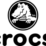
Crocs logo and symbol, meaning, history, PNG
- Download PNG Crocs Logo PNG The logo of the shoe brand Crocs is instantly recognizable due to its main character, a crocodile.
- It certainly doesn’t look like the logo of any other shoe brand.
- Meaning and history Crocs is a relatively young company that achieved phenomenal success in almost no time.
- Producing comfortable and easy-to-wear clogs manufacturers with innovative foamy material, the company made its shoes iconic and the logo — instantly recognizable.
- 2002 — 2006 The original Crocs logo, designed in 2002, was composed of a green emblem, placed on the left from the monochrome wordmark in all capitals.
- The green emblem depicted a funny smiley crocodile, which had green contouring.
- As for the inscription, it was executed in a custom sans-serif with extra-bold black lines, and thin white ones, coming through their middles, to make the logo lighter and more dynamic.
- Today the Crocs logo features a solid black and white emblem, where the iconic crocodile is drawn in where on a black background, and outlined in black and white.
- Symbol The Crocks logo features a crocodile.
- To be precise, you can see its head and upper part of the body (with the two upper paws) placed inside a circle frame.
- Wordmark emblem The lettering looks friendly and modern due to the rounded shape of the glyphs.
- The insignia features lowercase letters based on a circle shape.
- While the designer might have used this font as a base, he customized the proportions of the glyphs and the width of the lines, which resulted in the wordmark having a unique style.
- Colors The crocodile and the wordmark are typically given in black and white, and still, you probably have come across a neon green version of the Crocks logo.


Leave a Review