Crayola logo and symbol, meaning, history, PNG
- 1928 – 1930 The new Crayola logo was by far better legible due to a type featuring the letters of single height and width.
- It didn’t look cluttered, too, as the intricate frame disappeared.
- The letters were now red.
- 1939 – 1944 The glyphs grew slightly flatter and wider.
- 1941 – 1945 The letters grew more “serious” and bolder.
- They were now dark red on the yellow background.
- The lettering grew light, while the background grew dark.
- 1967 – 1983 The Crayola logo adopted a totally new palette, with the green letters over the yellow background.
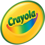
- 1997 – Today The design adopted an optimistic and artistic mood.
- The wordmark was now dark green with gradient and shades adding some volume.
- 2002 – Today The heavy, rectangular glyphs were replaced by an elegant type with varying widths of the strokes (Cronos Bold).
- The current type (Cronos Bold) looks plump and rounded, which creates a friendly impression.
- Colors Yellow and green have been present in the Crayola logo, in one form or another, for much of its history.
- And yet, the company has experimented with the palette a lot, changing the hues and the proportions, as well as adding various other colors.





Leave a Review