Contents
Courage The Cowardly Dog logo and symbol, meaning, history, PNG
- Download PNG Courage The Cowardly Dog Logo PNG Courage The Cowardly Dog is the name of an animated tv-series, which was launched in 1996.
- Being a horror-comedy, this funny show has released over 50 episodes (4 seasons) and became very loved all over the globe.
- Meaning and history 1994 1996 1999 – 2002 2014 The visual identity of the animated horror series has always been changed from episode to episode and complemented by different fonts and colors of the episodes’ names.
- But there is one logotype, that has been constantly in use by the show since 1999.
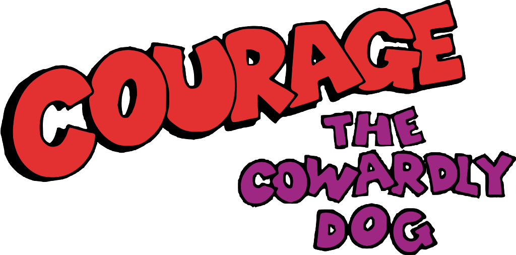
- The logo, designed for Courage The Cowardly Dog at the end of the 1990s, is composed of two text-based parts — the massive “Courage” in red, placed diagonally, and the jumpy “The Cowardly Dog” in purple, set in three levels, under the main wordmark, in its right side.
- Both parts are executed in a custom hand-drawn sans-serif typeface with extra thick lines and straight cuts and edges.
- Each letter on the logo is outlined in black, and the “Courage” part has a black shadow.
- This graffiti-style logo is bright yet not too much, it’s massive, yet not overloading.
- Despite its simplicity and visible amateurish execution, it looks cool and memorable, making the show stand out in the list of the competitors and adding a special mood to it.
- Purple is the symbol of mystery and imagination, while red adds a sense of power and passion.
- Though considering it is a horror-comedy, red can also stand for blood, while purple and black add a feeling of danger.


Leave a Review