Cotton Bowl Classic Logo
- Meaning and history The palette of the current Cotton Bowl Classic logo combines a dark and saturated shade of blue with a sunny shade of yellow, white, and a lighter shade of blue.
- 1995 – 1999 The original Cotton Bowl Classic badge was created in 1995 and stayed in use for four years.
- The words in the upper line had a stylized cotton flower image in red and white between them, and the bottom part was underlined by a small blue “Classic” with lots of air between the letters.
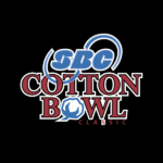
- 2000 – 2005 The redesign of 2000 made the Cotton Bowl logo bolder and stronger, keeping the original blue and red color palette, but enlarging the letters and writing them in a more distinct font, this time serif one.
- The red lettering of the main wordmark was set in red and outline in black, with the letter “O” in “Bowl” replaced by a stylized blue and white image of a cotton flower.
- The upper part of the badge contained a logo of the bowl’s sponsor, SBC, and the red logotype was underlined by a red uppercase “Classic” in sans-serif.
- In the center of the crest, there was a white horizontally stretched banner with the red “Cotton” lettering in an outlined geometric sans-serif with rounded angles.
- Under the banner, the red “Bowl” in the same font but the smaller size was set, having its letter “O” replaced by the iconic flower.
- The upper part of the crest was given to the new sponsor’s logo, AT&T, which was executed in white and blue.
- As for the “Classic” part of the logotype, it was set on the very bottom of the shield, in thin white capitals of a neat and simple sans-serif typeface.
- 2007 The color palette of the logo was intensified in 2007 and the contours of all elements were cleaned in the same year.
- 2008 – 2014 The blue and red color palette of the Cotton Bowl Classic logo was changed to orange and light blue in 2008.
- The body of the crest now featured a slightly gradient orange shade, which looked delightful and was evoking a sense of happiness and energy.
- The only element, which stayed in its original state was the “Classic” inscription which was still white and used the same thin and clean sans-serif typeface for its uppercase letters.










Leave a Review