evolution history and meaning
- The first Corvette was produced in 1953 and since then became extremely popular in America and then, worldwide.
- The Corvette logo was created in 1953 and the main idea never changed, it was only modified and modernized during the brand’s history.
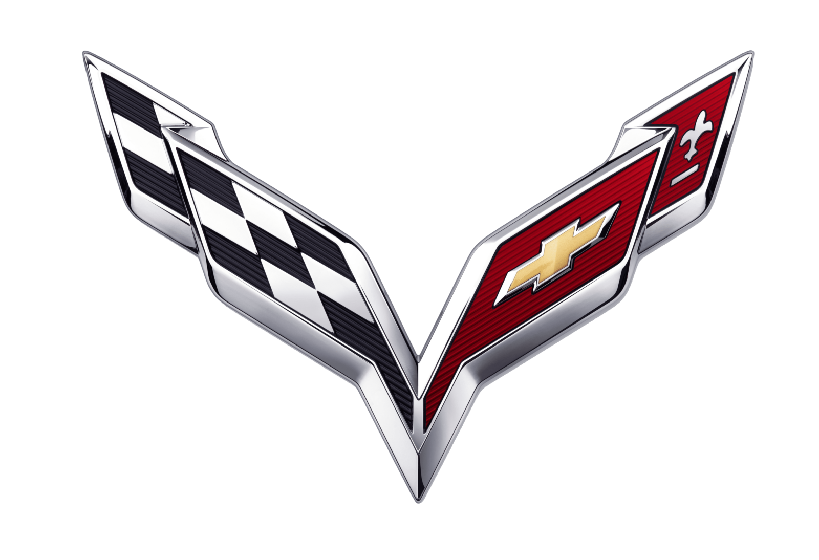
- One of the flags features a checkered monochrome racing pattern, while the second was colored red with a picture of fleur-de-lis and three horizontal lines.
- 1962 – 1967 The logo redesign of 1962 featured enlarged flags and removed wordmark.
- The letter “V” was added to the Corvette visual identity in order to celebrate the car’s V-8 engine.
- However, in two years the only lettering left on the logo was “Corvette”, placed beyond the flags.
- 1977 – 1984 In 1977 Corvette removes the circle and three years later, in 1980, the flags are modified, now they are composed of longer and thinner lines.
- The Corvette logo was redesigned and now featured a circle with a long thick rectangular crossing it.
- The left part was still a checkered flag, while the right part was composed of a Chevrolet symbol on a solid background.
- 1997 – 2004 In 1997 the brand introduces the new model of the iconic car, C5 Corvette.
- The logo was redesigned again and came back to the traditional emblem, the flags switched their sides and now the red flag was on the right and the monochrome — on the left.
- 2004 – 2014 The Corvette logo from 2004 featured shortened lines and a more compact design.
- 2014 – 2020 The Corvette logo from 2014 features futuristic bold forms and lines of the flags.
- 2020 – Today New Corvette logo is designed for the C8 Corvette and features the same two crossed flags, composing the letter “V” but in stronger and sharper lines.


Leave a Review