CONMEBOL logo and symbol, meaning, history, PNG
- Download PNG Conmebol Logo PNG During the first hundred years of its existence, the South American Football Confederation (CONMEBOL) used one and the same logo.
- It depicted the South American continent in green encircled by the flags of the countries that belong to the Confederation.
- Meaning and history 1916 — 1989 The very first logo for CONMEBOL was created in 1916 and stayed with the confederation for more than seventy years.
- It was an interesting and bright circular badge with the green contours of the South American continent in the middle.
- The green silhouette was set on a yellow background and enclosed into a colorful framing, consisting of various flags of the contoured from the continent.
- S. F.” Lettering in blue was set in the middle of the badge, over the green continent.
- 1989 — 2017 The redesign of 1989 kept the original concept and colors of the CONMEBOL visual identity, but strengthened the badge, cleaned the lines, and modernized everything.
- Now the middle part of the badge was more resembling a football, with its calm brown color and white stitches.
- The flags around the perimeter became brighter and more readable, while the green South American continent looked brighter even without a black outline.
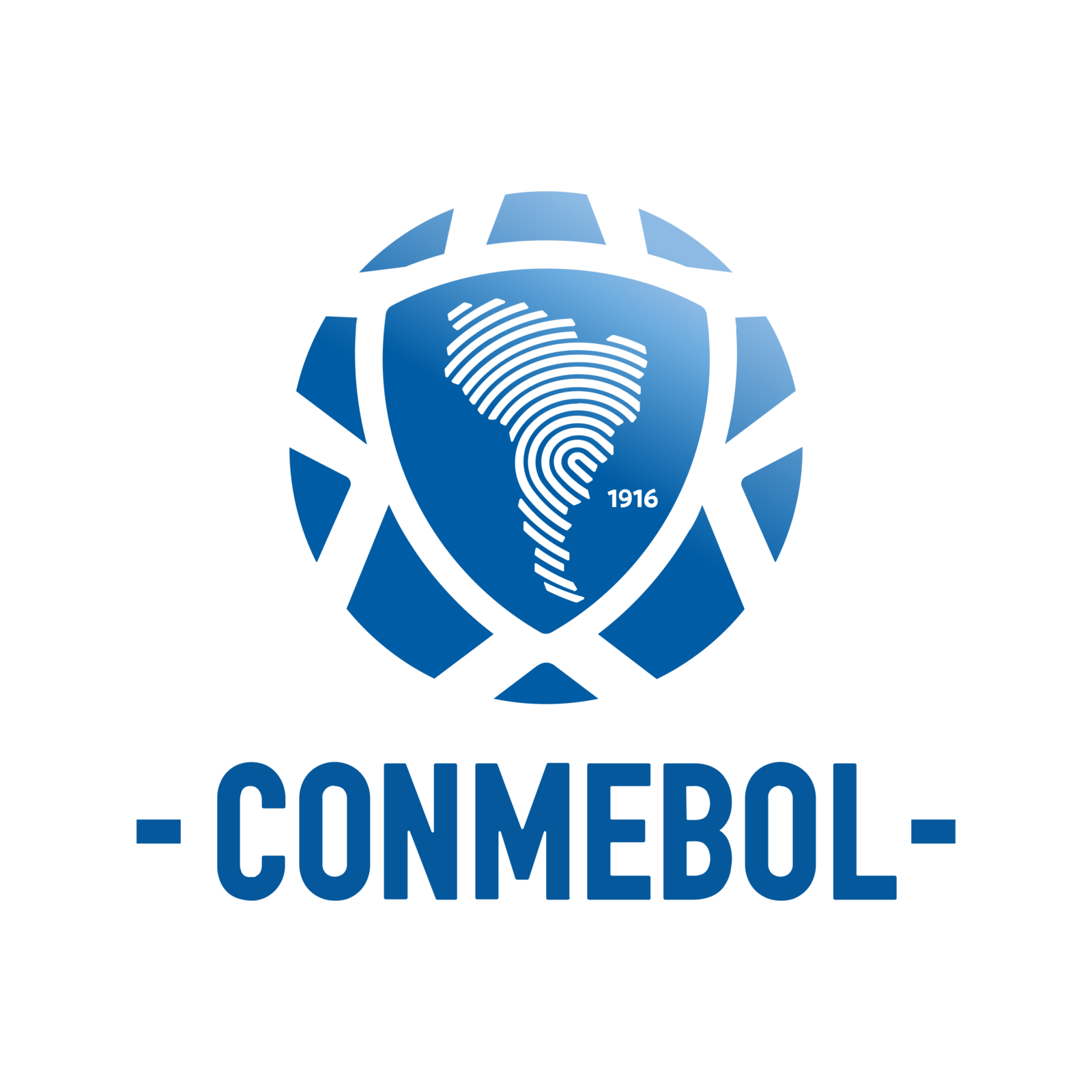
- 2017 — Today The current CONMEBOL logo, which was designed in-house, was introduced in 2017.
- The emblem features a stylized football.
- In the middle, there’s the map of South America filled with a unique digital fingerprint.
- The name of the confederation is given below in a bold san serif and condensed typeface.
- The abstract shape consists of 10 pieces, each representing one of the ten countries comprising the federation.


Leave a Review