Colorado Rockies logo and symbol, meaning, history, PNG
- Download PNG Colorado Rockies Logo PNG Being a member club of the National League, the Colorado Rockies baseball team has been competing in the Western division since 1993.
- As Denver, where the Rockies base, is close to the Rocky Mountains, the team got the name “Rockies”.
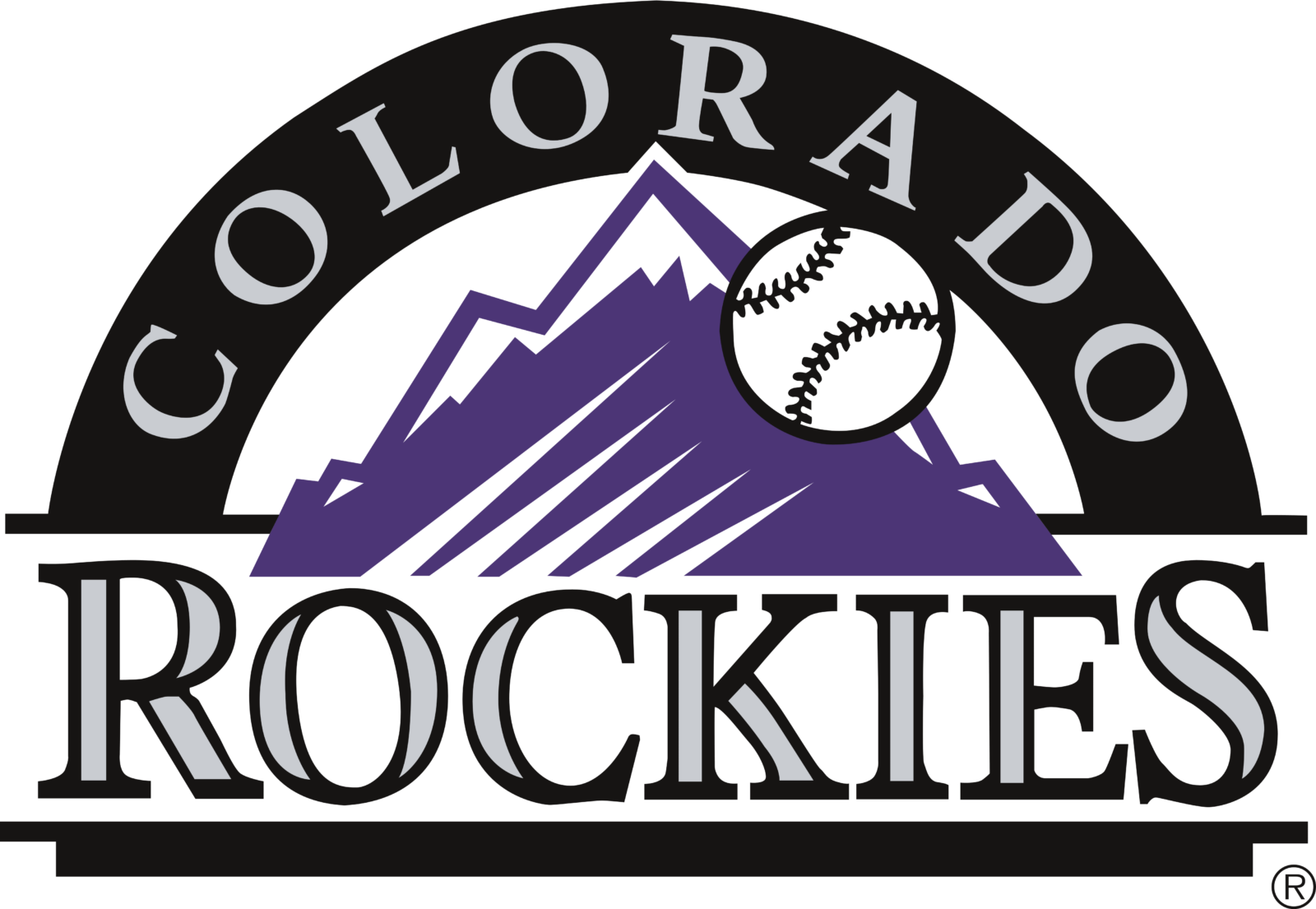
- Meaning and history 1993 — 2016 Over 27 years of the Rockies’ existence the team has had two rather simple, but elegant logos, in which they state obvious things just in two words and some pictorial.
- It features practically the same purple Rockies as in the earlier logo, a baseball going past them, an arch and the wordmarks “COLORADO” and “ROCKIES”.
- The color scheme itself did not change.
- Still there are some modifications.
- Thus, the arch is already black and the wordmark “COLORADO” inside it is silver.
- The baseball is placed not in the middle of the emblem, but to the right and somewhat higher, so it looks bigger in size.
- 2017 — Today The present Colorado Rockies logo can boast of a classic and rather laconic look.
- It consists of only two elements ‒ linked silver letters “C” and “R” with a black trim.
- The letter “C” stands for the state of Colorado and “R” represents the team’s nickname.
- This image used to be the team’s alternate logo in 1993-2016.
- Color The logo colors are purple, silver and black.
- The team also makes use of white in their uniform.


Leave a Review