Colorado Rapids logo and symbol, meaning, history, PNG
- Meaning and history Colorado Rapids has had three completely different logos during its not very long history.
- The first one was more a celebration of the region when the second one was all about football, and both themes were combined in the third emblem, designed for the club in 2007.
- The “Colorado” in green capitals was arched above the image.
- 2002 — 2007 The redesign of 2002 brought a completely new approach to the club’s logo design.
- The team went more minimalist and obvious, pitting a monochrome football in the middle of its badge.
- The new emblem of Colorado Rapids featured a circular badge with a thick blue outline where the bold golden wordmark was placed.
- In the middle of the badge, there was a smaller circle in white placed.
- On this circle the football was drawn, surrounded by a green stylized star, or the sun, or just a geometric figure with lots of pointed angles.
- The emblem from the beginning of the 2000s was something very common, but still featured the color palette of the previous logo, in order to celebrate the state’s amazing nature.
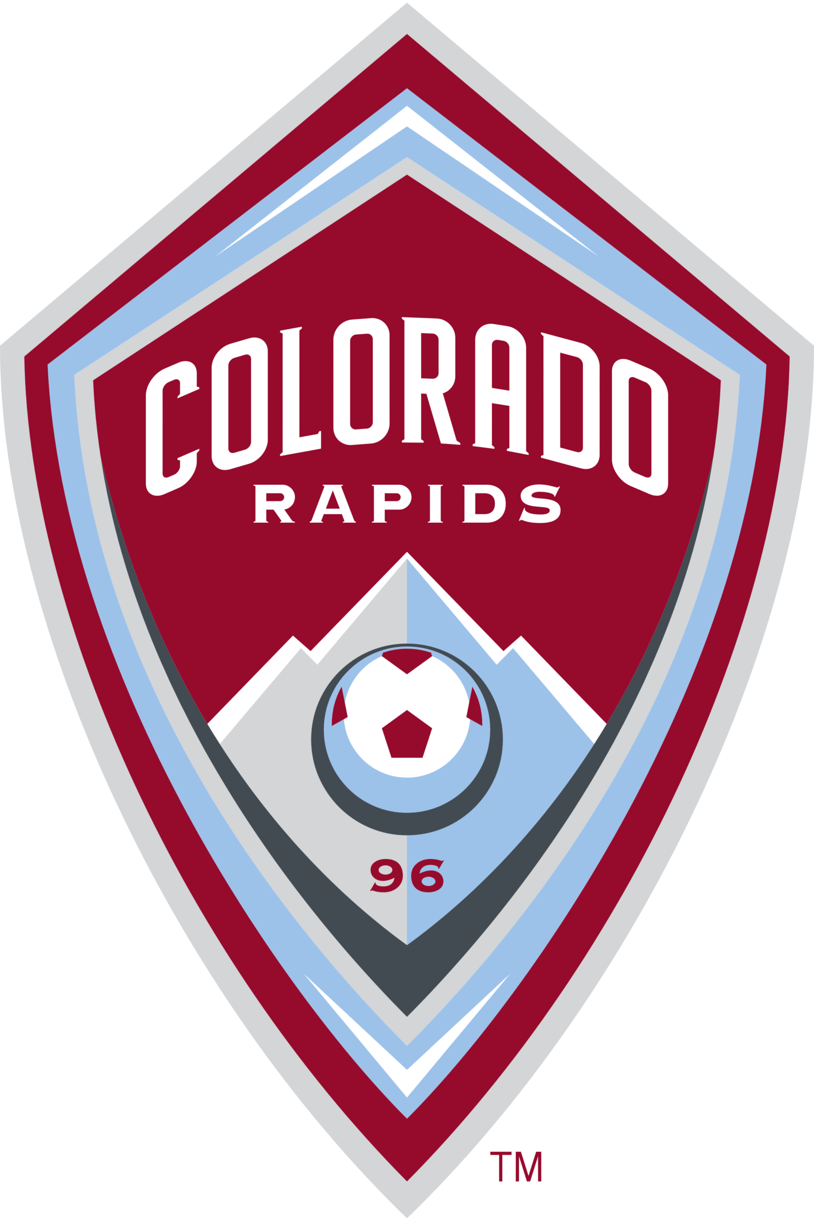
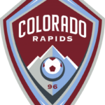
- 2007 — Today The sleek and modern logo for Colorado Rapids was introduced at the beginning of 2007.
- A completely redrawn badge with a new luxurious color palette looks profes-sional and sophisticated.
- The white and burgundy football is drawn on the mountain, and the club’s wordmark is placed above it.
- The badge features a thick outline in gray and light blue, which perfectly balances the picture of the mountain and adds a fresh and cool feeling to the whole image.
- Colorado Rapids Colors BURGUNDY PANTONE: 202 HEX COLOR: #862633; RGB: (134, 38, 51) CMYK: (9,100,64,48) SKY BLUE PANTONE: 278 HEX COLOR: #8BB8E8; RGB: (139, 184, 232) CMYK: (45,14,0,0) SILVER HEX COLOR: #8D9093; RGB: (141,144,147)





Leave a Review