Colgate logo and symbol, meaning, history, PNG
- Download PNG Colgate Logo PNG Colgate is the brand of dental care products, created in 1806 in the United States and owned by Colgate-Palmolive Group.
- Meaning and history The visual identity of the world’s most famous toothpaste has always been constant in its color palette.
- Once created at the end of the 19th century, the white and red composition was only changed in terms of style and typeface, but never — in colors.
- 1897 — 1946 The very first logo for the toothpaste was created in 1897 and featured sleek white lettering on a red background.
- The nameplate was set in two levels — “Colgate’s” was placed on top and enlarged, while the name of the product, “Ribbon Dental Cream” was written in smaller letters under the brand’s name.
- The nameplate was written in a custom sans-serif typeface with rounded shapes and slightly curved lines.
- The red background made the white color look even brighter and fresher, evoking a sense of cleanliness and shining.
- 1946 — 1963 The first logo stayed with the brand for more than 40 years and was only redesigned in the middle of the 1940s.
- 1963 — 1980 The redesign of 1963 brought a new style to the Colgate logo.
- The new logo looked modest yet contemporary and instantly recognizable.
- 1980 — 2001 The redesign of 1980 only slightly changed the typeface.
- It was a well-balanced and professionally executed logotype, which has been in use by the company for more than twenty years.
- The typeface became more sophisticated and gained smoother lines with slightly visible curves.
- Now the custom font of the nameplate was resembling Sanstone Heavy Italic, but with some lines shortened.
- The color palette and style of the logo remained the same, and even the change in the typeface was not very obvious, so nothing made the customers get used to a new visual identity, it was a very organic process.
- 2004 — 2009 In 2004 the company decided to add some volume and dynamics to its logotype, so the white inscription gained a burgundy shadow, which made the letters look brighter and more solid and confident.
- There were two variant of the logo — a flat one and the one with the shadow, which are both still in use today, along with the version, designed in 2018z 2016 — 2018 It was only for one year, from 2016 to 2018, when Colgate decided they need something new and changed their inscription with the new idea in mind.
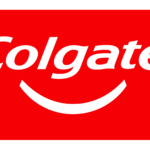
- 2018 — Today The current logo of the toothpaste is a combination of the versions from 2009 and 2017.
- Colors The Colgate logo is represented by two colors: red and white.
- This combination creates an optimistic and vivid mix, which is highly reflective of the brand’s success.





Leave a Review