Cirrus logo and symbol, meaning, history, PNG
- The purpose of the program is linking the MasterCard credit and debit cards to ATMs across the globe.
- Meaning and history 1982 – 1986 The original Cirrus logo already featured the circle theme and the blue palette characteristic of the current design.
- And yet, here, it wasn’t as minimalist and easy to grasp as it is now.
- Also, there was a dark blue rectangle in the background.
- It had serifs and strokes of varying thickness, which created even more noise.
- The semi-circle grew white, while the rectangle grew light blue.
- The type grew cleaner.
- 1996 – 2016 The number of sharp thorns grew smaller resulting in a sleeker emblem.
- And every time the MasterCard visual identity was redesigned, the Cirrus logo followed it.
- The Cirrus logo is composed of a wordmark with an emblem above it.
- MasterCard uses the same typeface for its logo.
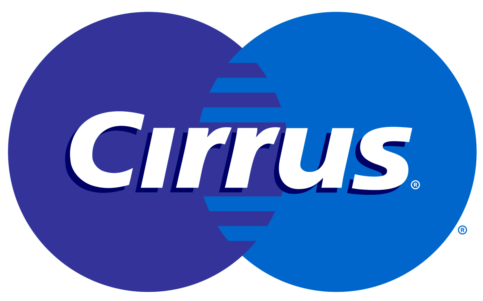
- The Cirrus emblem features two overlapping circles drawn in two different shades of blue.
- The darker circle is on the left, while the light blue one is on the right.
- And it successfully does.








Leave a Review