evolution history and meaning
- Download PNG Cinzano Logo PNG Cinzano is an Italian brand of vermouth, first introduced in 1757 by two brothers, Giovanni Giacomo and Carlo Stefano Cinzano.
- The brand is owned by Gruppo Campari since 1999.
- Since 1929 its icon was a lions head.
- 1914 – 1920 The original Cinzano logo was introduced in 1914 and featured a traditional heraldic image with a lion rampant standing on the left from the classy gothic-style monogram.
- The nameplate was arched above the “Vermouth Spumanti Torino” set in three lines of bold sans-serif capitals.
- The “Vermouth” was placed above the “Cinzano” lettering, and the “Spumanti” — under it.
- 1929 – 1974 The logotypes which became a basis for the current iconic emblem was first introduced by the brand in 1929.
- It was an uppercase bold black inscription executed in a strong modern sans-serif typeface with the letter “Z” in the middle enlarged.
- The lettering turned white and got placed on a black rectangular banner in a thin double frame, and on the left, from it, there was a contoured lion rampant emblem with the monogram and crown.
- 1935 – 1957 The color first appeared on the Cinzano emblem in 1935.
- The whole badge was outlined in bright yellow, which made it stand out and be memorable.
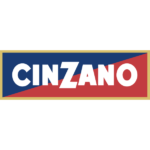
- Now the composition featured a dark blue triangle at the upper part of the badge and intense red, closer to burgundy, on the bottom.
- 1966 -1974 In 1966 the logotype turned red and the background was removed, so the red letters were placed directly on white.
- The white was also in the letters’ bodies — thin lines were coming through all the symbols, repeating their contours and making the whole inscription lighter and more individual.
- 1974 – 1990 The Cinzano logo, introduced in 1974, featured a completely different structure and style.
- 1990 – 2000 In 1990 the badge from 1935 returned to the Cinzano visual identity, being refined and modernized.
- The new badge was outlined in gold and had its blue and red colors intensified and cleaned.
- The white lettering was slightly enlarged, keeping its iconic typeface and shapes of the letters.
- The logotype turned black and got placed inside a white rectangle in a thin double frame, with a dot-contoured lion emblem from the very first Cinzano logo.
- 2000 – 2009 The contours of the badge, created in 1990, were refined in 2000, making the iconic blue and red emblem event stronger and more stylish.


Leave a Review