Cincinnati logo and symbol, meaning, history, PNG
- The club, nicknamed Orange and Blue, was not very successful in the league and was rebranded in 2018, getting Jaan Stam as the head coach.
- Today the club, owned by Carl Linder III, plays in MLS, Major League Soccer.
- Meaning and history The visual identity of the American soccer team has only had one major redesign in the club’s history, but the main theme and color palette remained the same as on the original version, created in 2015.
- 2015 — 2018 The original version of the logo was designed for FC Cincinnati in 2015 and stayed with the club only for three years.
- It was a solid blue crest with an orange outline and an interesting geometric top part, resembling a minimalist crown.
- Above the orange “crown” there was another smaller crest placed, colored orange, with no elements drawn on it.
- The main body of the crest comprised bold enlarged “FC” letters in orange sans-serif and a thin and delicate “Cincinnati” inscription in white.
- 2019 — Today The logo from 2019 is a modified and modernized version of the previous Cincinnati badge, which keeps all the main element a, but represents them in a more stylish way.
- The shield now features a more geometric and sleek shape, being wider and sharper than the one from the 2015 logo.
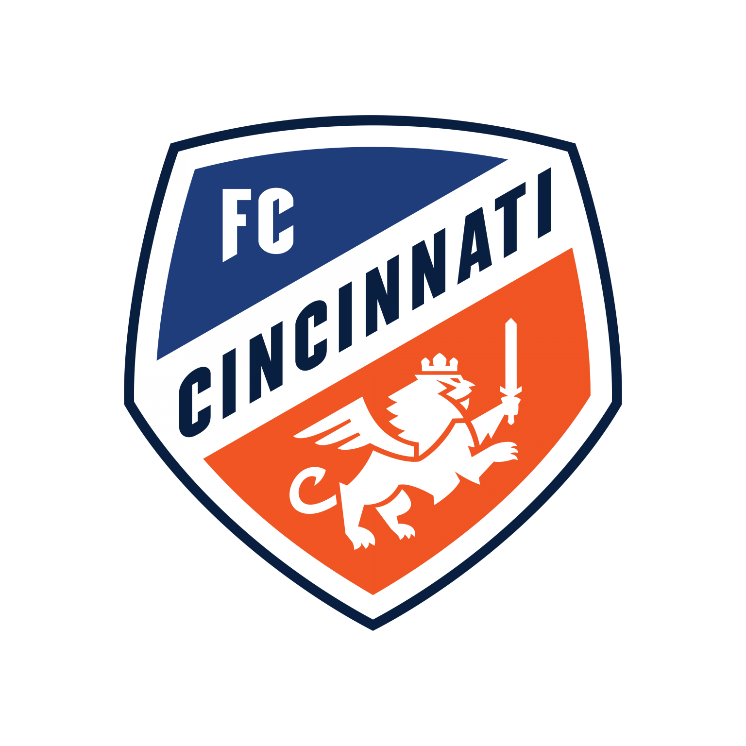
- It is colored blue and orange and diagonally sprout in two parts by a wide white line, coming from the bottom left to the top right corner.
- The line comprises a bold deep blue “Cincinnati” lettering in all capitals, executed in a custom clean sand-serif typeface.
- The upper part of the crest is colored blue and has only two white letters in it — “FC” with their edges cut diagonally and the tail of the letter “F” slightly elongated.
- The bottom and the bigger part of the crest are colored orange and have a white-winged lion with a sword on it.
- The heraldic symbol is enlarged in comparison with the previous version, and more visible.


Leave a Review