Chupa Chups logo and symbol, meaning, history, PNG
- Download PNG Chupa Chups Logo PNG Chupa Chups is an iconic brand of lollipops manufacturer, established in 1958 in Spain.
- Today the label is owned by Perfetti Van Melli and distributes its products all over the world.
- Meaning and history Derived from the Spanish word for “to suck”, “chupar”, the brand’s tag became synonymous to a ball-candy worldwide.
- The Chupa Chups visual identity was pretty simple and modest during the first ten years after the brand’s creation.
- 1961 – 1963 In 1961 the “Chupa” part was added to the logo.
- It was written in all capitals of simple sans-serif typefaces in black, above the custom red “Chups” with elongated curved tails of the letters.
- 1963 – 1969 In 1962 the fonts of both logo parts were refined and the yellow background was changed to a white one.
- The upper, “Chupa” part was now executed in a narrowed extra-bold serif typeface with delicate and sharp serifs on the ends of the thick straight lines, and the “Chups” red cursive was modified and emboldened.
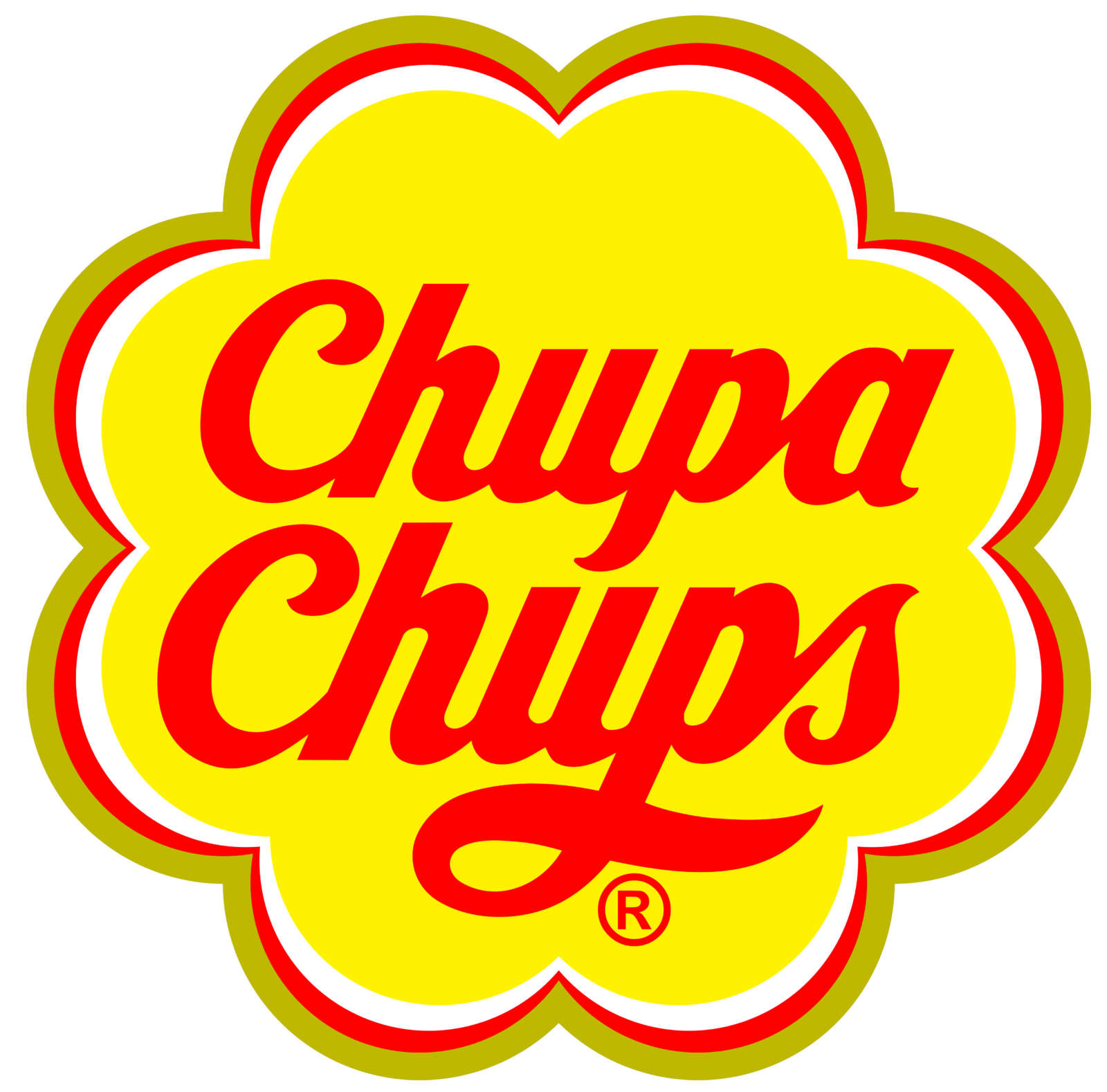
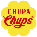
- 1969 – 1990 In 1969 both parts of the logotype gain red shade and are being placed on a solid yellow background, repeating the shape of a daisy flower.
- 1990 – Present Not much changed in the iconic logo since it was created.
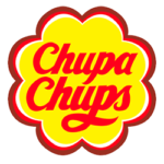
- The shape of the daisy was slightly refined and gained a white and red outline and the nameplate now is written in one typeface, which is still the signature bold cursive.
- The color palette of the Chupa Chups logo was also a little modified — the yellow became lighter and red brighter.
- Font and color The custom sans-serif cursive of the Chupa Chups visual identity looks sleek and elegant.
- The red and yellow color palette of the brand’s visual identity is an absolute eye-catcher, evoking a sense of energy, joy, and fun.





Leave a Review