Charlotte Checkers logo and symbol, meaning, history, PNG
- Download PNG Charlotte Checkers Logo PNG The minor-league ice hockey club Charlotte Checkers is the AHL affiliate of the NHL’s club Carolina Hurricanes.
- The Checkers were established in 1990 under the name of Capital District Islanders and were renamed the Albany River Rats upon moving to Albany, New York.
- Meaning and history 1993 – 2002 The very first logo of Charlotte Checkers was created in 1993 and stayed with the team for almost ten years.
- The animal a hockey helmet and the club’s uniform was placed on a circular background with a blue and black checkered pattern.
- The bold black lettering in classic sans-serif typeface was written around the perimeter of the badge.
- 2002 – 2007 The redesign of 2002 Modernized and simplified the badge of Charlotte Checkers.
- The bear now looked more dangerous and was placed on a solid red circle in a black outline.
- The orange color was removed from the uniform, which now turned blue and white.
- As for the inscription, it moved to the bottom part of the logo, with the “Charlotte” in swore slanted sans-serif letters “sitting” on a gray and black banner with a fancy custom “Checkers” wordmark.
- 2007 – 2010 Having relocated to Charlotte, North Carolina, in 2007, the team adopted the current name and the logo depicting a bear.
- The original color scheme included blue, white, and red.
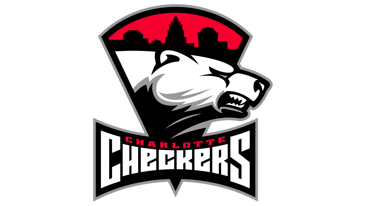
- 2010 – Today In 2010, the Charlotte Checkers logo was updated, and, as a result, blue was replaced by black.
- Colors The bear itself is white with silver elements and a black neck.
- The sky is bright red, the same color as the text “Charlotte.” The lettering “Checkers” is given in white, while the skyline is black.






Leave a Review