Catrice logo and symbol, meaning, history, PNG
- Download PNG Catrice Logo PNG Catrice is a German cosmetics brand, which was established in 2004 and became popular all over the globe due to its “high quality at affordable prices” policy.
- Today the brand has its stores in almost all the European counties and has a subsidiary in the United States.
- Meaning and history The Catrice visual identity is based on the principles of simplicity and minimalism.
- The cosmetics brand logo is composed of a wordmark with a tagline, executed in two different typefaces in a monochrome color palette.
- The classic black and white combination of the brand colors represents the company at its best, showing the power and confidence, alongside expertise and authority.
- When placed on the cosmetics packaging, Catrice logo can be executed in different colors, depending on the product line: from light gold and tender pink on black glossy surfaces to silver and black nameplate on transparent glass bottles.
- The “Catrice” inscription uses a custom sans-serif typeface, where all the letters except for “A” and “E” are capitalized.
- The brand’s “A” is the most elegant and eye-catching letter of the logo, with its smooth lines and a slightly curved tail.
- It adds style and individual character to the nameplate.
- The tagline of the logo, containing the “Cosmetics” lettering in all caps is executed in a simple and traditional sans-serif font, where the neat and clean letters have a lot of space between each other, which makes the logo airier and light.
- Review The German brand offers a wide variety of make-up cosmetics and nail care goods, which are available in drugstores and supermarkets at very affordable prices.
- The company’s aim was to create a good quality of cosmetic items so that any girl or woman could afford it.
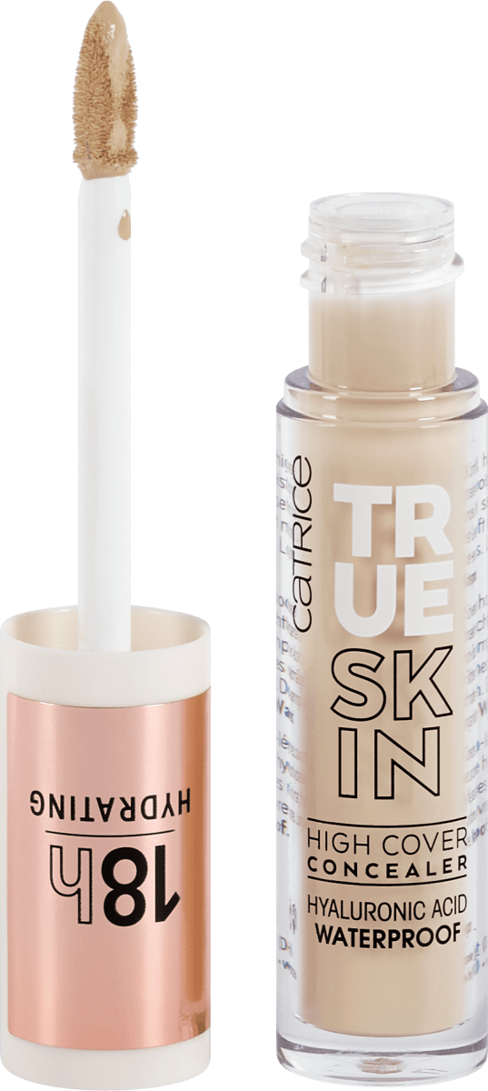
- The Brand’s range has everything from foundations and primers to lipsticks and make-up brushes and accessories.
- The brand also releases a limited edition make-up collection each season.






Leave a Review