Carlsberg logo and symbol, meaning, history, PNG
- Download PNG Carlsberg Logo PNG Carlsberg is a high profile beer brewing company from Denmark, which today has a global network of enterprises.
- The company is renowned for its pioneering of effective brewing methods.
- For political reasons, the logo was abolished in the 1930s.
- The company’s current logo goes back to 1904.
- It was hand-drawn by Thorvald Bindesbol, an industrial designer from Denmark.
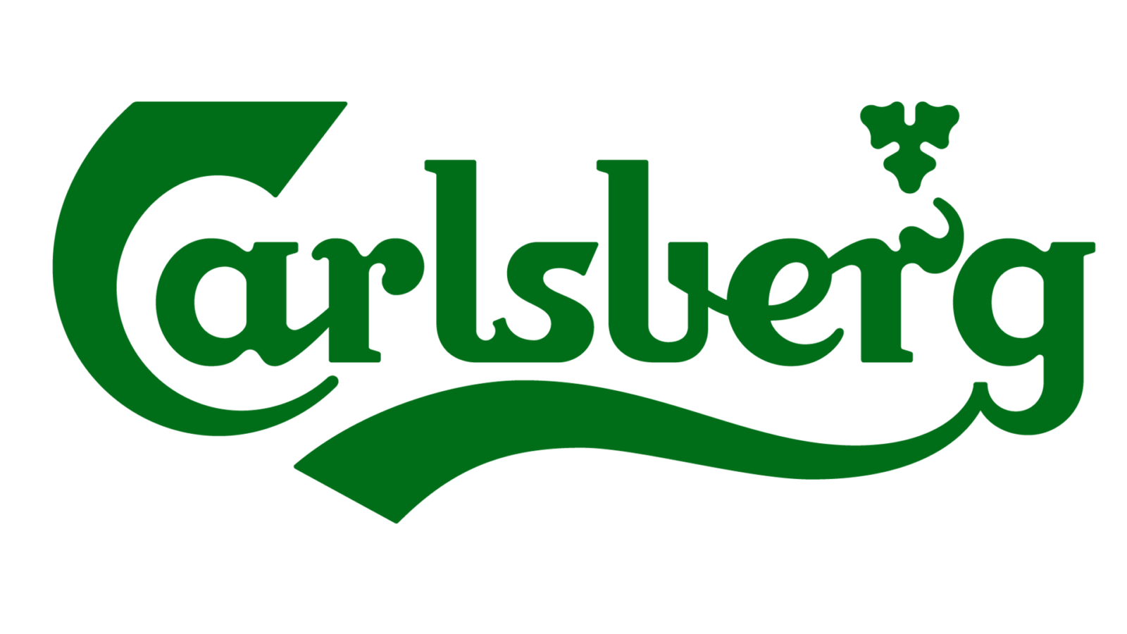
- The logo features the Company name, and the font pretty much retains the designer’s handwriting.
- It is topped by a red-and-gold crown, which symbolizes the company’s ties with the Royal Danish Court.
- The Carlsberg logo represents four colors: green, white, gold and red.
- The colors of the crown remain unchanged.
- In 2004 – a century since its introduction – the Danish Design Center endowed the logo with a design prize.
- The inscription was handwritten and had the tails of the “C”, “R” and “G” elongated and playfully curved.
- The emblem depicted a three-leaf with rounded details and triangular shape, which is placed pointing down and resembling a fine snowflake when the logo was drawn in a reverse color palette — white on green.
- 2018 – Today The redesign of 2018 made the Carlsberg logo fresher and more elegant by elevating its color palette to white and a lighter shade of green, which Joe evokes a sense of success and growth.
- The typeface of the nameplate was refined and softened, making the lines of the inscription thinner and more rounded.


Leave a Review