Cagliari logo and symbol, meaning, history, PNG
- Download PNG Cagliari Logo PNG Meaning and history All the logos used by Cagliari Calcio since the 1950s have been inspired by the flag of the island of Sardinia, where the Italian soccer club is located.
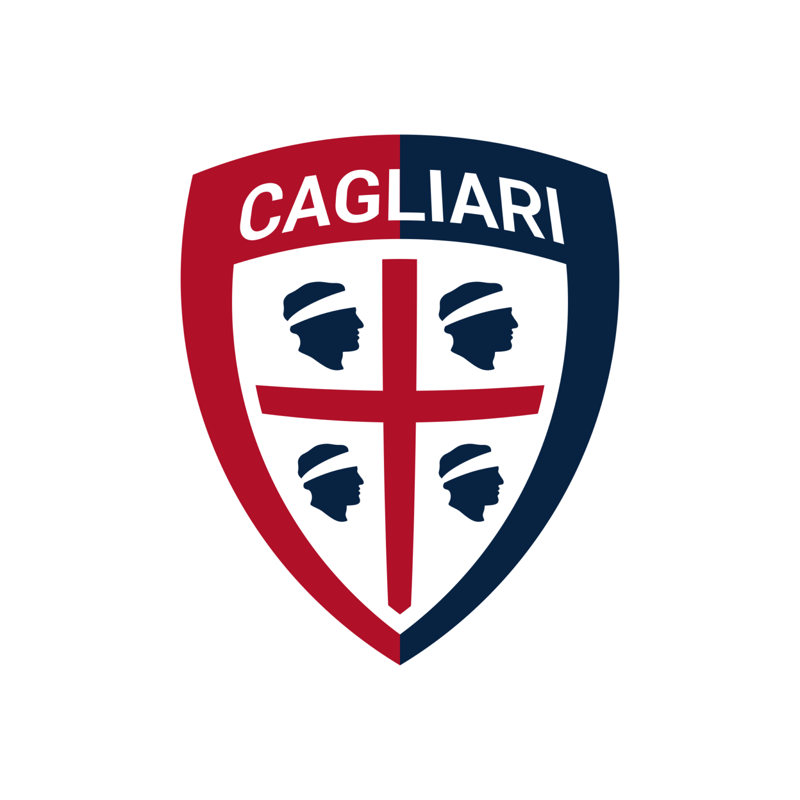
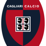
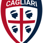
- On the dark blue field, the legendary Four Moors from the flag of Sardinia can be seen.
- At the top of the shield, the gold lettering “U.S.
- Cagliary” on the white background can be seen.
- The softened triangle pointing down with both sides arched from the center was now executed in a dark blue and red color palette with the Italian flag ribbon waving at its bottom part, and a white-and-black wordmark banner placed above the top border of the crest.
- 1995 — 2010 The redesign of 1995 introduced a bold and modern version of the Cagliari logo.
- The blue and red crest was now placed in an oval, which was vertically divided into two equal parts — dark blue on the left, and red on the right.
- The “1920” datemark was also added to the new badge, placed under the crest in the same style as the “Cagliari Calcio” inscription.
- 2010 — 2011 The colors of the Cagliari badge got brighter in 2010.
- White lettering on the badge turned to gold, with the ornate leafy gold frame added around the oval medallion.
- The typeface of the “Cagliari Calcio” wordmark was switched to a bold serif one, to elevate the elegance and sophistication of the refreshed gold blue, and red composition.
- 2011 — 2015 The redesign of 2011 kept the color palette of the badge but darkened the shades of blue, red, and gold.
- The most known explanation of the emblem is that these are the heads of the Moorish princes defeated by the Aragonese.
- Cagliari Colors NAVY BLUE HEX COLOR: #002350; RGB: (0 35 80) CMYK: (100 90 38 39) RED HEX COLOR: #AD002A; RGB: (173 0 42) CMYK: (21 100 88 15) WHITE HEX COLOR: #FFFFFF; RGB: (255 255 255) CMYK: (0 0 0 0)




Leave a Review