Cagiva logo and symbol, meaning, history, PNG
- Download PNG Cagiva Logo PNG Cagiva is the name of an Italian motorbikes manufacturer, which was established in 1950 as a metal detail producer, and changed its direction to motorcycles at the end of the 1970s.
- Today the company, headquartered in Varese, is very well-known and reputable across the world.
- Meaning and history 1978 – 1985 The original Cagiva logo already showcased the elephant, which has been its core part ever since.
- Unlike the minimalist modern logo, the old ones depicted the whole animal, not only its head.
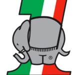
- In the 1978 version, the creature was gray with black trim and was placed over the number “1.” The number combined a green stripe with white and red ones.
- It had a flat sole housing the wordmark “Cagiva” in a bold sans.
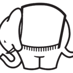
- 1985 – 2000 Only the elephant was left, while the “1” disappeared with all its colorful stripes.
- The animal was now white with a black outline.
- 2000 – Today The Cagiva visual identity has always been bright and unique.
- Its funny mascot, an elephant, has always been a part of all the brand’s logos but has evolved a lot during the years, turning from a funny and bright image into a strong and modern emblem.
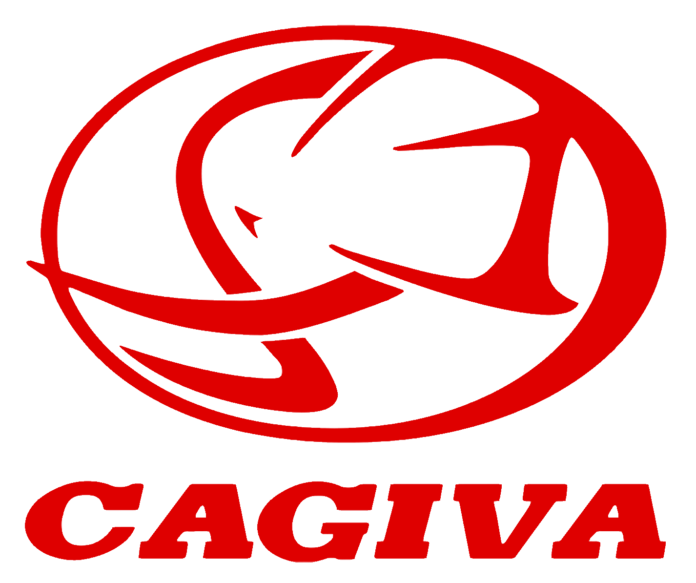
- The emblem with the wordmark under it is usually drawn in red and placed on a white background, but sometimes the colors are switched and white lines of the logo are being placed on scarlet red.
- The main brand’s symbol, an elephant, is drawn in profile, looking to the left, and enclosed in a thick horizontal oval.
- As for the wordmark, it is written in all capitals of a bold italicized sans-serif typeface, where the letter “C” is slightly extended.
- On the older version of the logo, which is also still used by the brand, the inscription features a custom serif font with massive square serifs.





Leave a Review