Burnley logo and symbol, meaning, history, PNG
- Since then it has experienced ups and downs, but each time it manages to survive.
- When we say “Burnley logo” we mean their emblem which is sometimes referred to as a badge or a crest.
- That year Prince Albert came to the stadium Turf Moor to watch the match between Burnley and Bolton.
- 1935 – 1960 The Burnley logo, used by the club in the 1930s, was based on the classy heraldic symbol — the Prince of Wales’s coat of arms, executed in burgundy, white and yellow color palette, with come light blue elements.
- The crest was placed on a bigger solid burgundy crest-shaped background and was accompanied by an arched ribbon with yellow lettering and an elegant yellow image of the bird in the upper part of the logo.
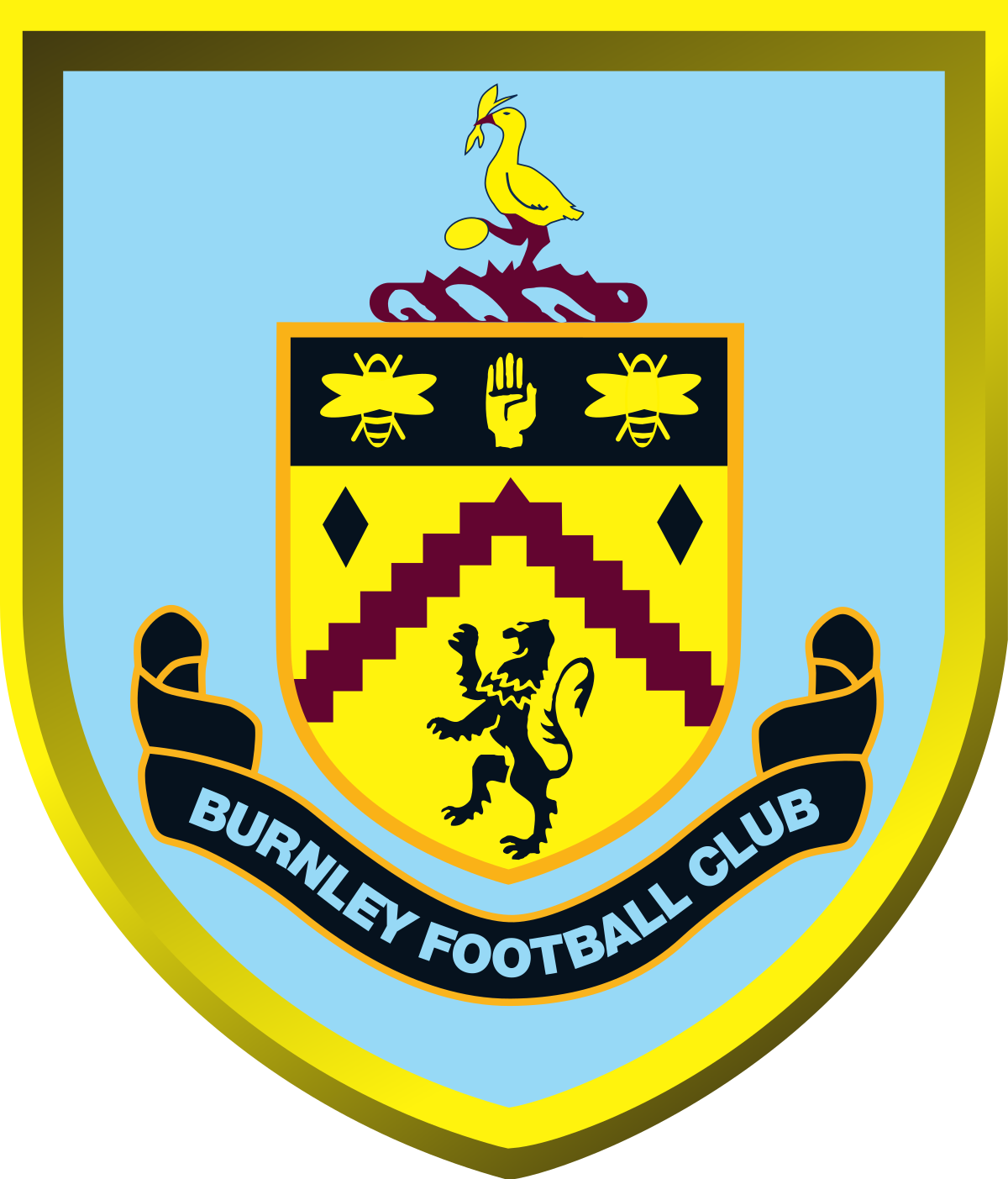
- 1960 – 1969 The redesign of 1960 switched the color palette of the Burnley logo, and now the bigger crest featured light blue, and a thick yellow framing, which was balanced by the smaller yellow crest.
- The ribbon with the lettering was now executed in black, and balanced by the upper part of the Prince of Wales’s coat of arms, in black with three yellow symbols.
- 1969 – 1975 In 1969 the club started using a very simple and even naive logo — three diagonally placed letters “BFC” in light blue.
- The symbols were executed in a very elegant cursive typeface and set from the upper left corner to the bottom right.
- This badge was used by Burnley for six years.
- 1979 – 1983 The heraldic logo came back to the club’s visual identity in 1979.
- The light blue ribbon with the white uppercase lettering on it was placed under the graphical part of the Burnley visual identity.
- 1983 – 1987 In 1983 the club starts using a simple monogram as its official logo against this time three italicized cursive letters were written in dark burgundy, close to purple, and set in one line, separated by three solid dots in the same color.
- 1987 – 2009 The crest from 1979 came back to the Burnley logo in 1987 but in a new color palette.
- And the wordmark in white was set on the ribbon under the badge, followed by the “1882 — 2007” datemark.
- The only difference between the new and the original versions were in the inscription on the ribbon at the bottom of the badge.
- 2010 – 2015 The redesign of 2010 was again only about the lettering on the ribbon.
- This time it featured the traditional “Burnley Football Club” inscription in the uppercase of a simple yet strong sans-serif typeface, in light blue.
- What is Burnley?
- Burnley is the name of one of the oldest British football clubs, which is also known to be in the list of the pioneers to become a professional team.




Leave a Review