Bundesliga logo and symbol, meaning, history, PNG
- It was created in the summer of 1962 in Dortmund at the Westfalenhallen.
- 1996 This version had virtually nothing in common with the current one.
- The logo was a rectangle consisting of two parts.
- The left part featured a white football with black hexagons.
- The right field was black with the white writing “Died Bundes Liga” and a triangular emblem, also in white.
- 2002 The design was also made up of two parts.
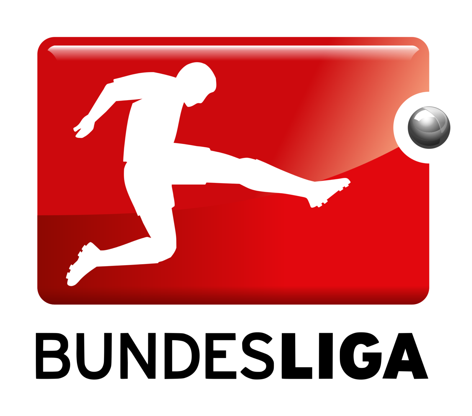
- The pictorial part featured a jumping football player and a football.
- The player was white, while the background was red.
- The second field featured the lettering “Bundes Liga” in two lines.
- The writing was black, while the background was white.
- In either case, they were decorated with a thin rectangular border with rounded corners.
- There was some depth to the logo due to the red and gray gradient.
- 2012 This version reflected the fact that the 2012/2013 playing season was the 50th anniversary season.
- 2017 The player on the Bundesliga logo has been redrawn.


Leave a Review