Buffalo Bisons logo and symbol, meaning, history, PNG
- Download PNG Buffalo Bisons Logo PNG A team called the Buffalo Bisons started playing in Buffalo, New York.
- Meaning and history It’s perfectly natural that the animal featured on the logo of the baseball team the Buffalo Bisons is a bison.
- But in what way is the creature unique and how has it been evolving over the years?
- 1985 — 1987 The first Buffalo Bisons’ emblem was designed in 1985 and stayed with the club for a couple of years.
- It was a caricature of a bison in the club’s uniform and cap, with the baseball bat in its hands.
- The “Bison Baseball” wordmark was set above those lines in two levels, with the upper one enlarged, written in dark blue, and the bottom one in red, executed in a smooth playful font, in the lowercase.
- Only the animal in blue contours is left in the logo.
- Another change was made to the bison’s cap — on the original version it was white with a blue “Biz” lettering, and now it changed to a blue cap with a red visor and a red capital “B” in the middle.
- Now the animal got a two-leveled inscription on its right again — the “Buffalo” in blue capitals of a modern sans-serif typeface, and the enlarged script “Bisons” in red with a double white and blue outline.
- It was a very bright and fancy logo, which stayed with the club for almost ten years.
- The lettering was executed in a strong square typeface, with the red letters having a thin gold outline and a moss-green shadow.
- Under the bison the wordmark in two lines was set: a slanted orange serif “Buffalo” in a square serif font, and a large light blue and white “Bisons” under it.
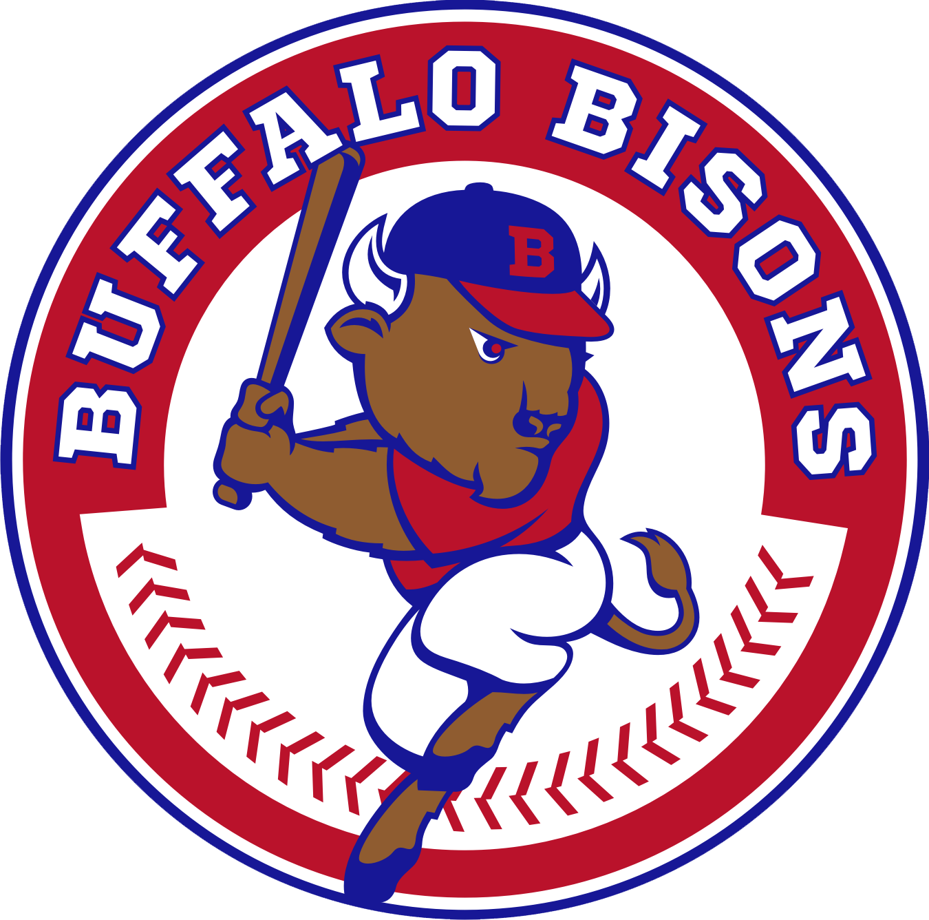
- 2013 — Today Like the bison on the 1985 Buffalo Bisons logo, the current one is also holding a bat in its paws, but this time, its head is tilted less, and because of this simple detail the overall impression is very different.
- Part of the International League, today Buffalo Bisons are now known as the Triple-A affiliate of the Toronto Blue Jays.






Leave a Review