Buffalo Bills logo and symbol, meaning, history, PNG
- Download PNG Buffalo Bills Logo PNG One of the most known professional American football teams, Buffalo Bills have gone through four logotypes over more than half a century of their history.
- The first Buffalo Bills logo depicted a herd of buffaloes and 2 players in front of them.
- All these were placed inside a dark blue shape resembling a football.
- Who owns the Buffalo Bills?
- This version was only used for a year, and as soon as in 1962 it was heavily modified.
- The buffalo and the background were given in shades of brown, while the football player was wearing the blue uniform and white helmet.
- 1960 — 1961 The Buffalo Bills logo from 1960 only stayed with the club for a few months.
- The ball featured a bright blue background and an image of two buffaloes and two players on its bottom part.
- The bold white “Buffalo Bills” wordmark in the uppercase was arched about the image, on blue.
- On the right part of the ball, there was an image of a player in a bright blue jersey, with a brown rugby ball.
- It was simpler and clearer than its predecessor.
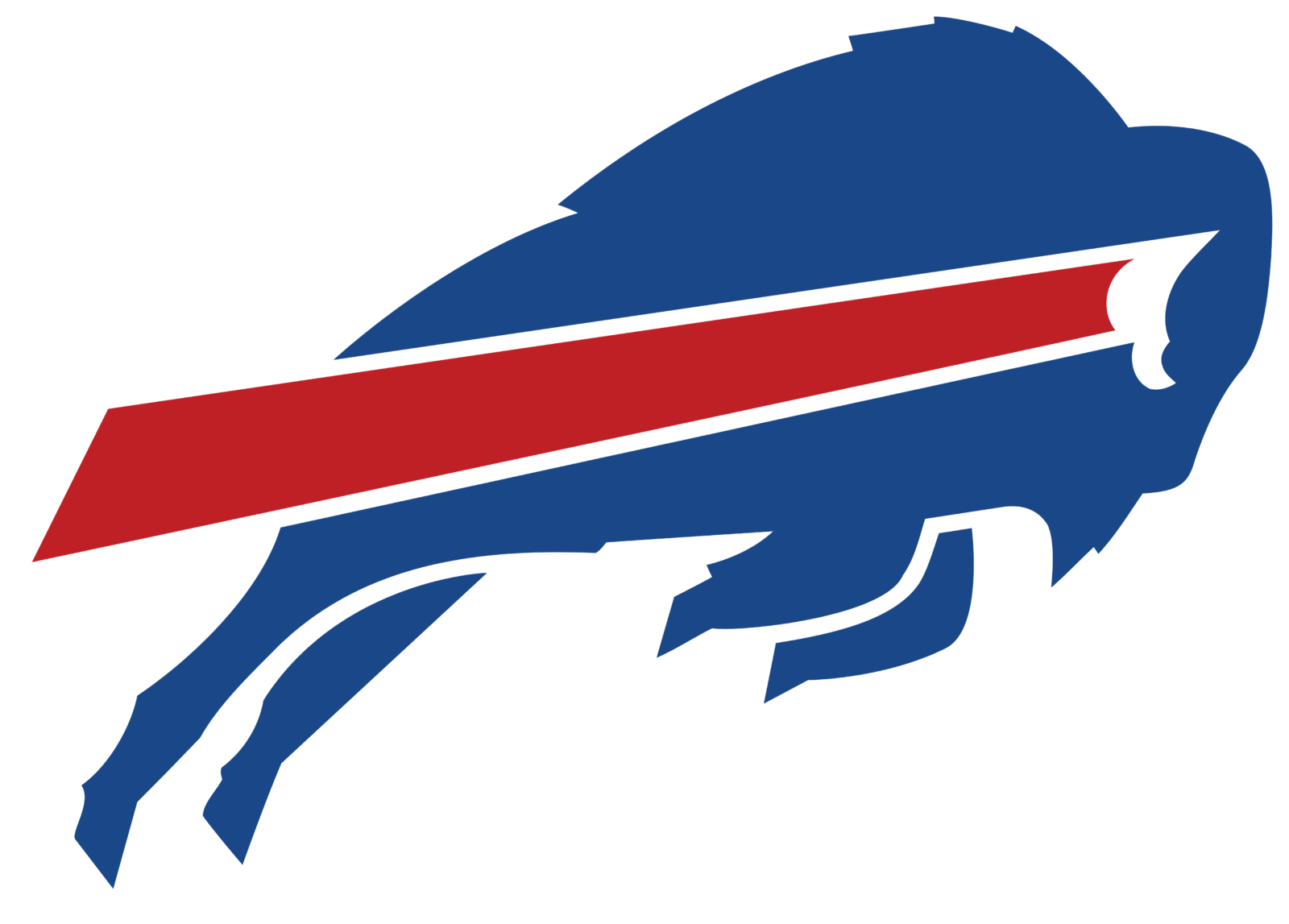
- 1974 — Today The Buffalo Bills logo adopted in 1974 has a more energetic and dynamic look.
- Font The Bills wordmark features a solid serif typeface.
- Color The three colors featured in the Buffalo Bills logo are actually the team’s official colors that can also be seen in their uniform: royal blue, red, and white.




Leave a Review