Brisbane Broncos logo and symbol, meaning, history, PNG
- It was during that match that the first Brisbane Broncos logo made its debut.
- Meaning and history The team founders were Barry Maranta and Paul Morgan, who used to play in the Brisbane Rugby League.
- Initially, the team’s logo was supposed to include a kangaroo and the letter “Q,” which had been present in the emblem of the Queensland Rugby League for decades.
- Among other suggestions that were eventually ruled out were the Cooktown Orchid (the state flower) and such Australian animals as the brumby, possum, galah, and the kookaburra.
- 1988 — 1999 Similar to the original kits, the first logo was dominated by gold.
- It featured a yellow wild horse with the team’s name inside a white shield with a maroon border.
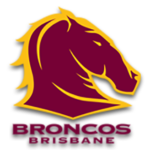
- 2000 — 2006 The maroon color dominating the current logo is by far closer to the shade that has been traditionally associated with Queensland rugby league and Queensland sport in general.
- 2007 — Today Font Being highly legible and traditional, the type is also unique and is clearly linked with the pictorial part of the logo.
- The serifs are so tiny and thin that it’s possible to overlook them at smaller sizes and the type may seem a sans serif one.
- At larger sizes, they become more prominent and you can see their delicate shape create a visual rhyme with the sharp and thin edges of the horse’s mane.
- Colors Maroon and gold dominate the Brisbane Broncos logo, while white is left for the accents and the background.
- The three colors are deeply rooted in the history of rugby league in Queensland.
- The palette of the jerseys underwent several modifications (including the addition of blue in 2001) until it came to its current style.
- Now, the color taking up most of the surface in both the jerseys and the logo is maroon (the shade is close to Hex: #760036, RGB: 118, 0, 54).





Leave a Review