Braga logo and symbol, meaning, history, PNG
- Download PNG Braga Logo PNG Braga is the name of the Portuguese football club, which was established in 1921.
- The club, nicknamed “The Archibishops” (which is “Os Arfebisops” in Portuguese) and coached by Carlos Carvalhal, today is one of the most successful in the country.
- Meaning and history The visual identity of the Portuguese club had its major redesign just once in history.
- Though both the main versions of the logo features the same style and mood, the emblem, created in the 1930s became official and was only slightly modified throughout the years.
- The 1920s — The 1930s The logo, designed for Braga FC in 1921 was composed of a classic crest with a pointed top part.
- The crest was vertically divided into two equal parts — a green one on the left, and a white one on the right.
- The 1930s — Today In the 1930s the visual identity is being redesigned.
- It becomes brighter and gets more detail on it.
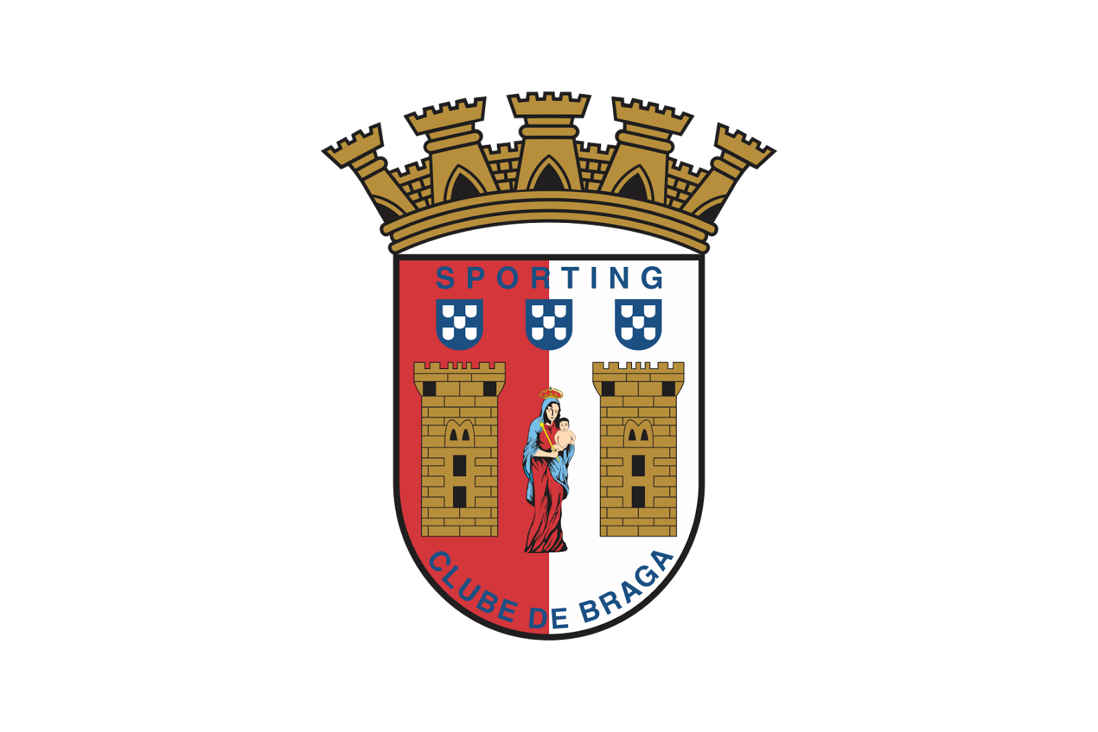
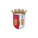
- The shape of the crest now features a rounded bottom part and a stylized crown on top.
- The crown is composed of a golden-brown stonewall with towers.
- The body of the crest is vertically divided into red and white halves, and each of the parts has an image of a square stone tower on it.
- The drawing of the Virgin Mary with Jesus is placed in the center of the emblem.
- Above the images, there is three blue and white crest with checkered pattern located, and higher — the “Sporting” lettering in blue capitals.
- The “Clube de Braga” in-scription is arched along the bottom side of the crest and features the same blue sans-serif typeface.





Leave a Review