Boston Red Sox logo and symbol, meaning, history, PNG
- Meaning and history 1901 — 1908 However, the very first logo of the club was blue and white.
- A bright red sock with white lettering, placed on its vertical part, that is how the original Red Socks logo looked like.
- 1912 — 1924 The “Boston” inscription was changed to “Red Sox” in all capitals.
- The nameplate was also arched and fully repeated the style and font of the previous version.
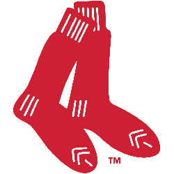
- 1924 — 1960 The pair of Red Socks without any inscriptions was the logo for the baseball team from the middle of the 1920s.
- The emblem was slightly refined in 1979, the socks were moved into the middle of a circular emblem, creating a better balance and making the logo more harmonized and solid.
- One more difference from the previous version — the white lines of the socks was replaced by two white rhombuses, along with the white square on the heel.
- It was composed of the previous version with the ball and socks, enclosed in a rounded frame, consisting of two circles.
- The “Boston Red Sox” inscription was placed on the frame, around its perimeter.
- The “Boston” part was in black with the red outline, while the name of the club featured a bright red color and a thin black around it.
- 2008 — Today The current logo of one of the main American baseball teams was designed in 2008.
- It is the same pair of red socks, but with refined and smoother lines, which make the whole image look more modern and confident.
- As an additional logo, the club uses a custom ornate letter “B” in red, which was designed in 1933 and was replicated in the logo version of 1976, used by all the lettering.
- The typeface of the emblem is pretty close to Hessian, a special historical font, based on the ancient handwriting.
- Symbol evolution The 2009 emblem In comparison with its predecessor, the current official Boston Red Sox logo is much simpler.
- If you take a closer look, though, you will notice they are not identical – the white streaks of the Boston Red Sox old logo have been replaced by larger white elements.
- Color The team’s three official colors are red, dark blue, and white.
- However, the Red Sox team logo features only two of them, red and white.
- Dark blue can be seen on some of the secondary logotypes (the wordmark and the “B” emblem, for instance).
- The Boston Red Sox logo font, which is called Bosox, is somewhat similar in style to the team’s primary logo.


Leave a Review