Bostik logo and symbol, meaning, history, PNG
- Download PNG Bostik Logo PNG Bostik is the name of adhesives and sealants manufacturing company, which was established in 1889 in the United States.
- Today the company headquarters in France and is a part of the Arkema Group.
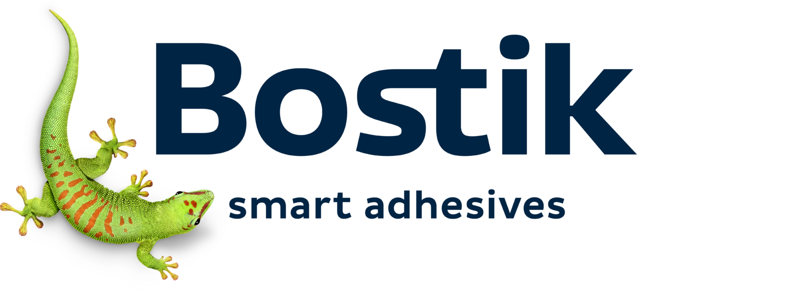
- Containing a very detailed image of the company mascot, the brand’s logo is fresh and crispy, composed of a wordmark and an emblem.
- Gecko is also known to be a symbol of rebirth and energy, which are also important qualities for any business — the ability to grow and develop whatever happens.
- The company’s mascot also reflects such qualities as efficiency and adaptability, which perfectly suit the Bostik products.
- The green and blue color palette of the corporate logo represents a strong and powerful company, with its creative and innovative approach to manufacturing and distribution.
- The deep blue of the wordmark shows the company as stable and confident, while the green lively emblem adds a sense of energy and inspires.
- Font The company’s wordmark is executed in a modern and sleek sans-serif typeface, which is very close to Cabrito Sans Ext Extra Bold, but with its angles sharpened and its letters’ cuts more distinct.
- One more modified element of the typeface is the connecting horizontal bar of the letters “S” and “T”, which also represents the company’s essence — adhesive materials production.
- The label’s nameplate is complemented by a delicate tagline “Smart adhesives” in the lowercase, which is written in a more traditional font, similar to Pluto Sans Medium.
- Review Bostik is a company with a very rich history.
- In the middle of the twentieth century, the company became famous as one of the world’s leaders in the chemical industry.
- In 2015 the brand got a new owner — Arkema, which started it’s new are its development.
- Today the company has its operational offices in almost 50 countries across the globe, where 5 thousand of the Bostik employees work.






Leave a Review