Bosch logo and symbol, meaning, history, PNG
- The brand has a perfect reputation and is known for the highest quality of its products.
- The company’s visual identity was redesigned a few times during its history, but the main principles always remained the same: simplicity, clarity, and quality.
- It was composed of a wordmark with two ornaments on both sides and an emblem on the left.
- The wordmark consisted of the company founder’s name, Robert Bosch, and was written in an elegant typeface with fine yet confident lines.
- The first Bosch emblem was composed of a vertically located oval with a graphical representation of the burning magnet inside it and the electrical bolts and lines coming out of it.
- 1907 — 1914 In 1907 the Bosch logo was redesigned.
- The emblem changed to a circular form and kept the image of the magnet inside it, the magnet was placed vertically (from what we used to see on the latest Bosch logos).
- Bosch’s visual identity becomes more minimalist and modern.
- Now it is composed of all capital letters of the wordmark, executed in a traditional sans serif font with thick letters, that a spaced very close to each other.
- The emblem features thin lines, which adds a sense of professionalism and simplicity.
- The color scheme of the 1914 logo was monochrome with the gray body of the letters.
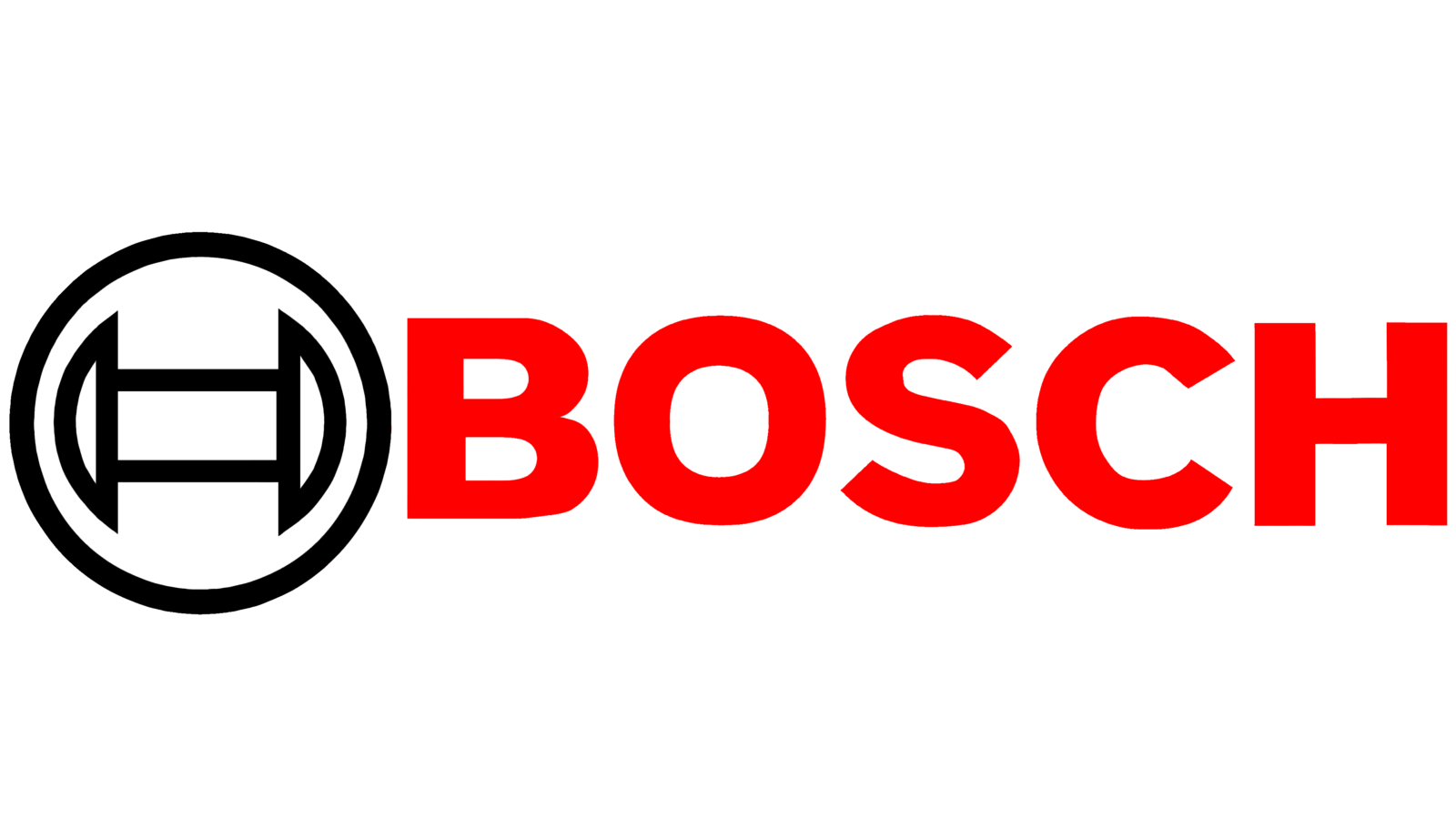
- 1925 — 1981 The iconic today Bosch color palette was created in 1925.
- The red color for the wordmark is complemented by the black of the emblem.
- 1981 — 2001 The redesign of 1981 included a new typeface and bolder lines of the emblem.
- The nameplate became narrower, yet the letters themselves — thicker, the red color of the wordmark got a darker tone, which was brilliantly balanced by a strong and decent emblem.
- The “metal” emblem stayed with the brand for 17 years until the last brand’s redesign in 2018.
- 2018 — Today The company decides to simplify its visual identity and changes its logo back to a 2D version but keeping the gray color scheme of it.
- The current Bosch logo is a representation of the brand’s heritage and power, it shows the company’s passion and progress, without sacrificing quality and research.
- Font and color The iconic Bosch logo uses a solid and bold sans-serif typeface for its wordmark, which looks powerful and confident, brilliantly reflecting the character and approach of a reputable company.
- The red, gray, and white color palette of the Bosch visual identity is a representation of strength, confidence, and professionalism, though the use of gray instead of black makes the logo more delicate and elegant, showing the company’s value of style and individuality.




Leave a Review