Boost Mobile logo and symbol, meaning, history, PNG
- Download PNG Boost Mobile Logo PNG Boost Mobile is a brand of telecommunication company, providing wireless services in America and Australia.
- Meaning and history 2001 – 2008 Every change in the Boost Mobile logo can be described as part of an evolution, never a revolution.
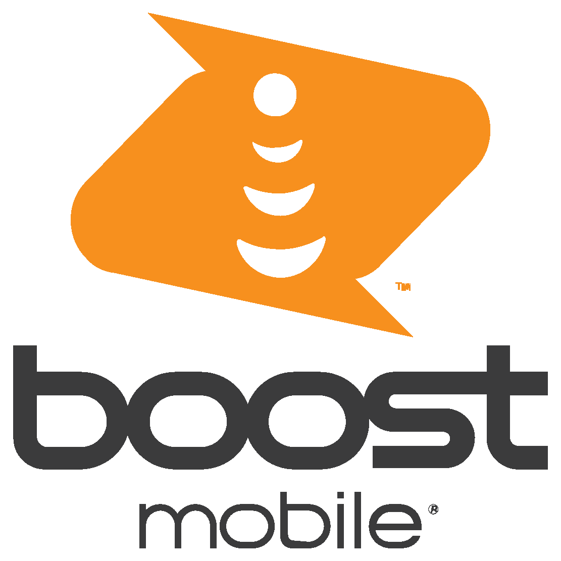
- It features an orange emblem consisting of two dynamic shapes.
- Below, there is the lettering “Boost mobile.” Like in the current logo, the glyphs are lowercase, and the first word is larger and bolder than the second one.
- However, the type here is italicized and looks bolder.
- Also, the letters don’t touch each other.
- The touching shapes probably work better in conveying the “communication” message.
- The “communication” theme is represented in the wordmark by the glyphs that are touching each other.
- The “s” and “t” even form a single glyph, which looks dynamic.
- The type has grown lighter.
- The emblem is an abstract geometrical image, consisting of two equal parts, forming a dynamic symbol with two angles sharp and two rounded.
- The orange and black color palette of the Boost Mobile logo is a representation of energy and creativity, as well as a powerful and influential brand, which values the quality of services and progress.
- The brand switched the colors in its logo depending on the placement, but the most common color combination is black for the wordmark and orange for the emblem, located on a white background.
- The Boost Mobile logo is confident and progressive.


Leave a Review